Web Programming
HTML
hyper-text markup language, defines the structure of the web, make up of a series of “elements” defined by “tags”.
Each element can have a unique id attribute, used for CSS and JS
Document Object Model(DOM), HTML is a tree, while each element is a node.
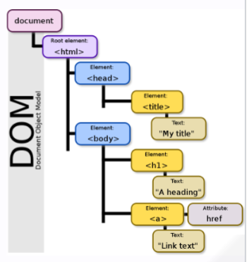
Tags
html: encapsulate entire html documenthead: include metadata, such as CSS and JS scriptsbody: main HTML contentwh1: headersp: paragraph textstrong,em: connotationa`: anchor text(links)
img: images (withaltattribute)br: linebreakul,ol,li: liststanle,threads,tbody,tr,th,td: tablesdiv: divisions(sections)form: encapsulates many inputslabel: label an input (includeforattribute)input: user inputbutton: buttons
CSS
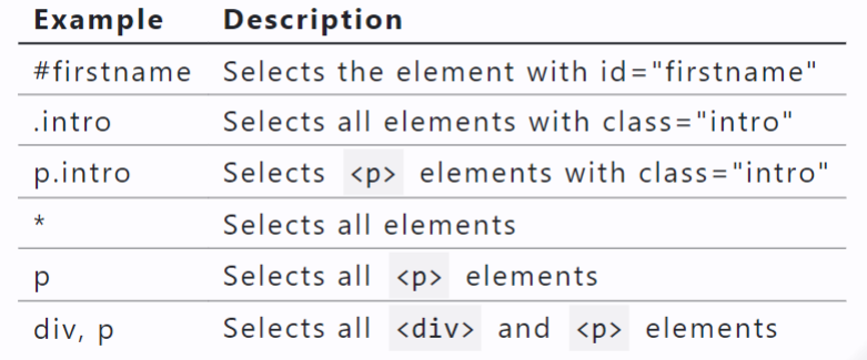
Cascading Sytle Sheets, defines the styles to be used, uses a cascading hierachy of selectors and decoration boxes consisting of key-value pairs
.inline-add {
  display: inline-block;
  width: 32px;
  height: 32px;
  background-color: rgb(42, 130, 253);
  margin: 0.5rem;
  border-radius: 5px;
  border-color: rgb(52, 91, 124);
  color:rgb(255, 255, 255);
  text-align:center;
}
.block {
  width: fit-content;
  font-family:Philosopher;
  height: 320px;
  border-radius: 10px;
  margin: 0.8rem;
  border-style: dashed;
  border-color: rgb(105, 136, 136);
  padding: 15px;
}
Different ways
- Inline
<div style="background-color: powderblue">
    <h1 style="font-size: 4rem " >Badger</h1>

<ul>
    <li style="background-color: orange">a heavily built omnivorous nocturnal mammal</li>
    <li style="color: red" >of the weasel family</li>
    <li>typically having a gray and black coat.</li>

</ul>
<p style="text-align: right" >From the <strong>Oxford</strong> dictionary</p>
</div>
- Internal
<style>
 #main-div {
  background-color: green;
  margin: 1rem;
}
li {
 color: yellow;
 font-size: 1.25rem;
}
.right-text {
 text-align: right;
}
</style>
- external
Same as internal but with styling in an external file, e.g. styles.css Include stylesheet in HTML with…
<link rel= "stylesheet" href="styles.css" />
Not all browsers support all CSS
JavaScript
JS is a dynamic, loosely-typed language. The data type is inferred from the declaration and can be changed.
Variables
Variables are containers that hold data.
7 standard data types: numbers, string, boolean, null, undefined, symbol, object.
The first 6 are considered primitive and are stored on the stack, object is considered complex and stored on the heap.
Variables can be declared with var, let, const. let,const are preferred
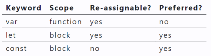
Query the data type at runtime using typeof.
Conditionals
if,else if,elseswitchstatementsevalExpr ? trueExpr : falseExpr
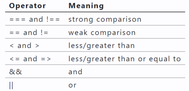
Comparison and Logical Operators
Objects
Objects are unordered collections of data defined using key-value pairs. These are sometimes referred to as “attributes” or “properties”.
let teachingAssistant = {
firstName : "Alice",
lastName : "Smith"",
age: 24
};
console.log(teachingAssistant);
unordered collections of data defined using key-value pairs. (attributes/properties).object.attribute or object["attribute"]
Arrays
An array is a variable that contains multiple elements, do not have to be the same type
let example=['apple',17,undefined, true, null,"coconut"];
example.push(100);
Loops
for (let i = 0; i < 10; i++) {}
for (let attr in course) {
break;
}
for (let item of arr) { //item
continue;
}
for (let item in arr) { //index
continue;
}
while (cond) {}
do {} while (cond);
Functions
A procedure that includes a set of statements that performs a task or calculates a value.
function ftoc(temp){
    return (temp - 32) * 5/9;
}
ftoc(88);
const ftoc = function(temp){
    return (temp - 32) * 5/9;
}
const ftoc = (temp) => {
    return (temp - 32) * 5/9;
}
Others
jQuery
$("#login")
// Select element by ID
$('#elementID').css('color', 'red');

// Select element by class
$('.elementClass').hide();

// Select element by element type
$('div').fadeIn();
$('#myElement').css('background-color', 'yellow');

$('#myElement').addClass('newClass');
$('#myElement').removeClass('oldClass');
DOM
Use document to reference the DOM
document.getElementById('login')
Add an action for some elememt when some event happens:
title.textContent = "My Website!";
loginBtn.addEventListener("click", () => {
  alert("You are advancing to the next part..");
});
for (let callout of callouts) {
  callout.style.color = "red";
}
JSON
JSON: JavaScript Object Notation (JSON) is a structured way to represent text-based data based on JS object syntax.
JS objects: Definition: Objects are unordered collection of related data of primitive or reference types defined using key - value pairs.
difference: A JS Object is executable code;
JSON is a language-agnostic representation of an object. There are also slight differences in syntax.
{
    "name": {
        "first": "Xinran",
        "last": "Li"
    },
    "fromWisconsin": true,
    "numCredits": 14,
    "major": "Computer Science",
    "interests": [
        "Drawing",
        "Dancing",
        "Programming",
        "Delicious Food"
    ]
}
Conversion
JSON.parse(): JSON String → JS Object
JSON.stringify(): JS Object → JSON string
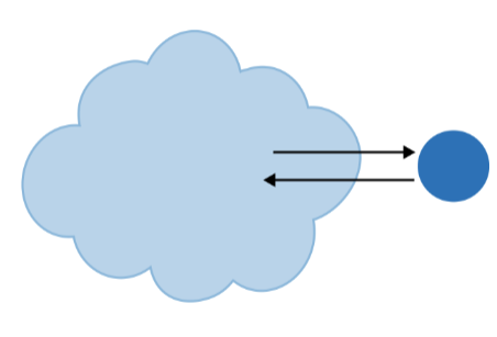
Requests can be synchronous or asynchronous .
asynchronous requests are recommended as they are non-blocking.
Typically, they use a callback when the data is received and lets the browser continue its work while the request is made.
Making Asynchronous HTTP Requests:
fetch: is a promise-based method.
Promise objects represent the eventual completion/failure of an asynchronous operation and its resulting value.
async / await — keywords to indicate that a function is asynchronous – will learn later!
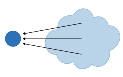
Definition: An application programming interface (API) is a set of definitions and protocols for communication through the serialization and de-serialization of
objects.
JSON is a language-agnostic medium that we can serialize to and de-serialize from!
Fetch()
 {
    fetch("https://cs571.org/api/f23/hw4/students", {
      headers: {
        "X-CS571-ID": CS571.getBadgerId()
      }
    })
    .then((res) => res.json())
    .then((data) => {
        console.log(data);
        setStudentdatas(data);
      });
  }
Callback Functions
Definition: A callback function (sometimes called a function reference) is passed into another function as an argument, which is then invoked inside the outer function to complete a routine or action.
Declarative vs Imperative Programming
imperative: for (let obj of arr) { /* stmts */ }
declarative: arr.forEach((obj) => { /* stmts */ })
Declarative array functions include forEach , map , slice , concat , filter , some , every , and reduce.
forEach , filter , and map
All are used on arrays.
All take a callback as an argument.
This callback then takes an argument* representing the current element.
students.forEach( (student) =>/* */ );
ids.map( (sId) =>/* */ );
grades.filter((grade) =>/* */ );
Other async Functions
setInterval(callback, interval)perform a callback function every interval milliseconds.*setTimeout(callback, timeout)perform a callback function in timeout milliseconds.*
slice(begI, endI) and concat(arr)
slice returns a shallow copy with an optional beginning (inclusive) and ending (exclusive) index.
["apple", "banana", "coconut", "dragonfruit"].slice(1,3);
concat joins two arrays together
["apple"].concat(["banana", "coconut"]);
some(cb) and every(cb)
some(cb) returns true if the callback returns true for some element of the array, false otherwise.
every(cb) returns true if the callback returns true for every element of the array, false otherwise.
reduce(cb, start)
reduce takes a 2-parameter callback (previous and current values) and a starting value.
[2, 4, -1.1, 7.2].reduce((prev,curr) => prev + curr, 1.2);// 13.3
const fruits = [ 'apple','banana', 'apple', 'orange ', 'banana ' , 'apple'];
const countobj = fruits.reduce((acc, curr) => {
    acc[ curr] = (acc[ curr] || 0) + 1;
    return acc;
}, {});
console.log( countObj); // Output: { apple: 3, banana: 2, orange: 1 }
... Spread Operator
shallow copies
const cats = [ "apricat", "barnaby", "bucky" , "colby"];
const newCats = [ ...cats, "darcy"];
?? Null Coalescing Operator
If left-hand is null or undefined , use right-hand.
const IS_ENABLED = env.IS_ENABLED ?? true;
const USERNAME = document.getElementById( "username" ).value ?? "";
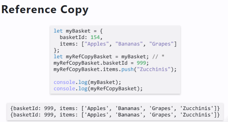
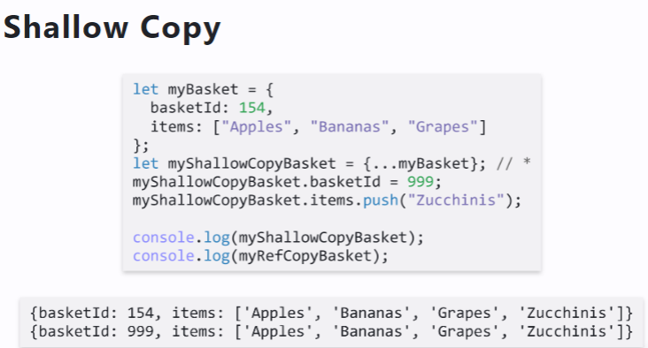
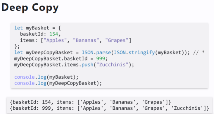
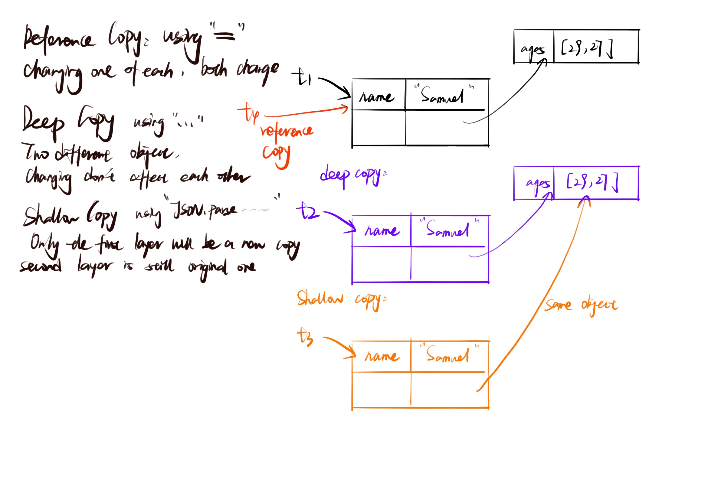
Data Copying
Sometimes we wish to make copies of data, e.g. we want to duplicate an array of student objects.
- Reference Copy
直接用=,两者都会改变
- Shallow Copy
基本用的都是扩展符...
自己:第一层变,第二层变
origin:第一层不变,第二层变 图上log写错了
- Deep Copy
基本用的是JSON.parse(JSON.stringify(obj))
第一层第二层都不会改
let t1={name:"Samuel",ages:[29,27]};
let t2=JSON.parse(JSON.stringify(t1));
t1=t2;
let t3={...t2};
t1.name="Jessica";t3.ages[0]=30;t2.name="Reese"
console.log(t1,t2,t3);
//t1 {name:"Reese",ages:[30,27]}
//t2 {name:"Reese",ages:[30,27]}
//t3 {name:"Samuel",ages:[30,27]}
let t1={name:"Samuel",ages:[29,27]};
let t2=JSON.parse(JSON.stringify(t1));
t1={...t2};
let t3=JSON.parse(JSON.stringify(t1));
t1.name="Jessica";t3.ages[0]=30;t2.name="Reese";t1.ages.push(20);
console.log(t1,t2,t3);
//t1 {name:"Jessica",ages:[29,27,20]}
//t2 {name:"Reese",ages:[29,27,20]}
//t3 {name:"Samuel",ages:[30,27]}
Grids
<div class=" container">
    <div class="row">
        <div class="col-12 col-md-6 col-lg-3"></div>
        <div class="col-12 col-md-6 col-lg-3"></div>
        <div class="col-12 col-md-6 col-lg-3"></div>
        <div class="col-12 col-md-6 col-lg-3"></div>
    </div>
</div>
React
React Definition: Also called ReactJS, React is a JS library for building user interfaces.
Refresher Definition: Document Object Model (DOM) translates an HTML document into a tree structure where each node represents an object on the page.
The Virtual DOM
Definition: The virtual DOM is a virtual representation of the user-facing elements that are kept in memory and synced with the real DOM when DOM elements are updated.
Reconciliation Definition: Reconciliation is the process of diffing and syncing the virtual and real DOM to render changes for the user.
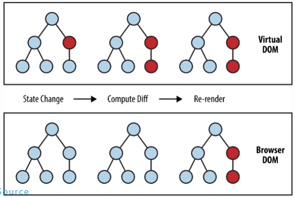
Benefits:
Incredibly fast, as only what is updated in the Virtual DOM is updated in the real DOM.
Abstracts away interactions with DOM; makes programming more declarative.
Used in React and vue.js; Angular does its own thing.
Re-render
State Changes: When a component’s local state changes using
this.setState()oruseState(for functional components), React will automatically trigger a re-render of the component to reflect the updated state.Props Changes: When a component’s props change, it will re-render with the new props. This includes changes to props passed from a parent component.
Parent Component Re-renders: If a parent component re-renders, its child components will also re-render, even if their state or props haven’t changed. React updates the child components to reflect any changes in the parent’s structure.
Context Changes: If a component subscribes to a context using
useContext(orthis.contextin class components), a re-render is triggered when the context value changes.
Component
Every component is a function, inheriting props and maintaining an internal state.
Modern Web can not interpret JSX.
JSX Basics: Curly braces {} interpolate a JS expression.
The return of a functional component is what that component renders.
export default function BakedGood(props) {
  const [number, set_number] = useState(0);

  return (
    <div className="block" style={blockstyle}>

      <div className="align-style">
        <p>{props.description}</p>
      </div>
      <div className="align-style">
        <p>${props.price}</p>
      </div>
    </div>
  );
}
React Hook
Hooks are small React features. Today, we will cover…
useState
Used to maintain state! Takes an initial value as an argument. Returns a pair of the read-only state value and a mutator function.
Always use the mutator function to modify state.
Never modify the state directly.
setSearch_name((name) => name.substring(0,oldName.length-1))
Remember we cannot mutate the state variable.
const [names.setName] = useState(["James","Jess"]);
setName(names => [...names,"Jim"]);
setName([...names,"Jim"]); //will cause infinite loop
Why?
When does React re-render a component? When…
- its
propschanges - its
statechanges - its parent
re-renders
We cannot (rather, should not) do push
useEffect
Used to perform an action on component load or state change. Takes a callback function and an array of state dependencies as arguments.
useEffect(() => {
    setShown_students((stdu) =>
      handleSearch(studentdatas, search_name, search_major, search_interest)
    );
    setPage(1);
  }, [studentdatas, search_name, search_major, search_interest]);
An invocation of useEffect specifies a callback function but does not specify anarray of dependencies.
then On component render and everytime something changes this callback function will be called.
Key
The key prop is used by React to speed up rendering.
Always use a unique key for the parent-most element rendered in a list.
This key needs to be unique among siblings.
This key should usually not be the index of the item (e.g. what if the order changes?)
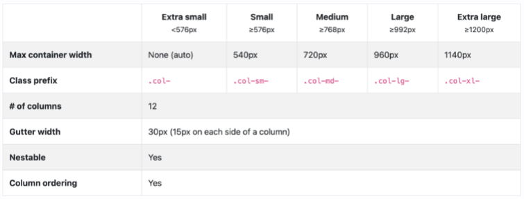
Responsive Design
Important takeaways…
Use Container , Row , and Col components.
xs , sm , md , lg , xl , and xxl are props
数字代表宽度
<Container>
    <Row>
        <Col xs={12] md={6} lg={3}></Col>
        <Col xs={12} md={6} lg={3}></Col>
        <Col xs={12} md={6} lg={3}></Col>
        <Col xs={12} md={6} lg={3}></Col>
    </Row>
</Container>
Pagination
function SomeBigData() {
    const [page, setPage] = usestate(1)
    return <div>
    {/*Display some data here! */]}
    <Pagination>
        <Pagination.Item active={page === 1} onClick={() => setPage(1)}>1</Pagination.Item>
        <Pagination.Item active={page === 2} onclick={() => setPage(2)}>2</Pagination.Item>
        <Pagination.Item active={page === 3] onClick={() => setPage(3)}>3</Pagination.Item>

    </Pagination>
</div>
}
When displaying the data, use slice to only show the items on the current page!
function SomeBigData() {
    const [page, setpage] = usestate(1)
    return <div>{
        bigData.slice((page - 1)*16,page * 16).map(name =><p>{name}</p>)
        }
            {/*Display Pagination Items here!*/ }
        </div>
}
Callbacks
do child-to-parent communication.
use useCallback in child function to call a parent function.
const TodoList = ( props) => {
    const [items, setItems] = usestate( );
    const removeItem = (itemId) => {
    //Do Remove !
}
return <div>
{
    items.map(it => <TodoItem key={it.id} {...it} remove={removeItem}/>)}
}
</ div>
const TodoItem = ( props) => {
    const handleRemove = () => {
    alert( "Removing TODo item! ");
    props.remove(props.id);
}
return <Card>
    <h2>{props.name}</ h2>
    <Button onclick={ handleRemove}>Remove Task</Button>

</Card>
}
useContext Hook
Three steps to using context.
- Create and export a context.
- Provide the context with some value.
- Use the context in a child component.
const BadgerLoginStatusContext = createContext([]);

export default BadgerLoginStatusContex
const [loginStatus, setLoginStatus] = useState(initiallogin);
 <BadgerLoginStatusContext.Provider alue={[loginStatus, setLoginStatus]}>
          <Outlet />
 </BadgerLoginStatusContext.Provider>
//-------------------------------------------------------------
function SomeChildComponent(){
    ```javascript

const [loginStatus, setLoginStatus] = useContext(BadgerLoginStatusContext);
}
Cookies
Accessing and manipulating cookies in JavaScript is done through the document.cookie property because cookies are associated with the document (web page) being viewed in the browser.
non-HTTP-only cookies be accessed using JavaScript using document.cookie
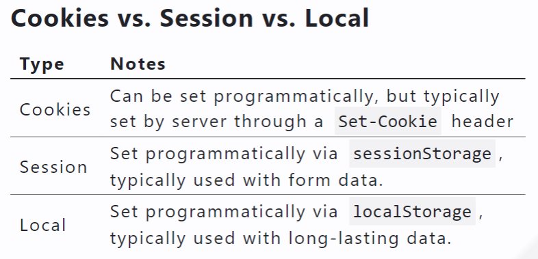
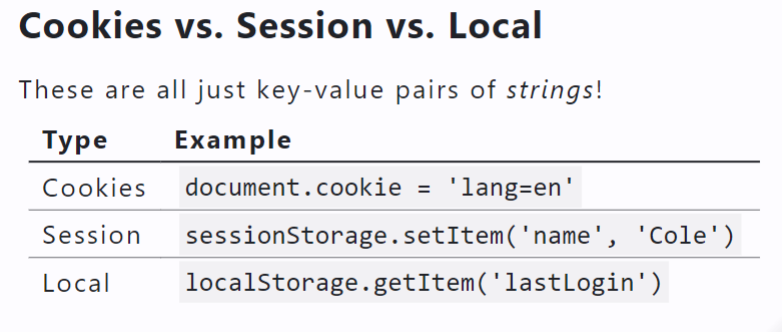
sessionStorage and localStorage
sessionStorage and localStorage only store strings! Use JSON.parse and JSON.stringify !
const initialSavedCatIds = JSON.parse(sessionStorage.getItem("savedCatIds") || "[]");
const updatedAIds = [...initialAdoptedCatIds, cat.id]; //add adopted
sessionStorage.setItem("adoptedCatIds", JSON.stringify(updatedAIds));
Navigation
Types of Routers:
BrowserRouter : What you typically think of!
MemoryRouter : Same as
BrowserRouter, but the path is hidden from the browser in memory!HashRouter : Support for older browsers.
StaticRouter : Used for server-side rendering.
NativeRouter : We’ll use react-navigation instead!
Routing
Using a Router , Routes , and Route !
<BrowserRouter>
    <Routes>
        <Route path=""/" element={<Layout />}>
            <Route index element={<Home />} />
            <Route path="about-us" element={<Aboutus />}/>
            <Route path="other-info" element={<otherInfo />}/>
            <Route path="*" element={<Home />} />
        </ Route>
    </Routes>
</ BrowserRouter>
Browser
<Outlet/> shows the component returned by the child route! e.g. in Layout we may see…
function Layout() {
    return (
      <>
        <Navbar bg="dark" variant="dark">{ /* Some navigation links. . .*/ }
        </Navbar>
        <outlet />

    </>
   );
}
useNavigate Hook
const navigate = useNavigate();
    navigate('/');
    navigate('/home');
Navigation
    <Navbar bg="dark" variant="dark">
        <Nav className="me-auto">
            <Nav.Link as={Link} to="/ " >Home</Nav.Link>
            <Nav.Link as={Link} to=" / about-us ">About Us</Nav.Link>
            <Nav.Link as={Link} to="/other-info ">other Info</Nav.Link>
        </Nav>
    </Navbar>
<outlet />
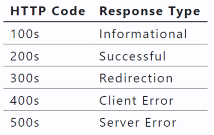
HTTP Recap
Data is transmitted by requests and responses that allow us to create (POST), read (GET), update (PUT), and delete (DELETE) data!
An HTTP request may have path and query parameters.
Here, AaronRodgers is a path parameter while all and since are query parameters.
HTTP requests (specifically PUT and POST ) may also have a request body. This is located below the headers.
For a JSON body, we need an additional HTTP header.
Content-Type: application/json
HTTPS
The “secure” version of HTTP.
Same thing as the HTTP protocol with end-to-end encryption. We use HTTPS for our API.
Fetching w/ POST , PUT , and DELETE
fetch can do a lot more than just retrieving data.
specify request method
specify request headers
specify request body
inspect response status
inspect response headers
inspect response body
Must include:"Content-Type": "application/json"
Uncontrolled vs Controlled way
In a controlled way: using its value and tracking onChange events
In an uncontrolled manner: using useRef
useRef
The value of a ref can be retrieved via its current property, e.g. inputVal.current.value
uncontrolled input component
const inputval = useRef();
return (
    <div>
        <label htmlFor="myInput">Type something here!< label>
        <input id="myInput" ref={inputVal}></input>
    </div>
);
This is opposed to controlling an input component via its value and onChange properties.
Pros & Cons:
React generally recommends controlled components.
Controlled components can cause many re-renders, however uncontrolled components give you no control over the onChange property.
In either case, each input should have an id associated with the htmlFor of a label
If you are using react-bootstrap components, be sure each Form.Control has an id associated with the htmlFor of a Form.Label
Credentialed Requests
It varies from system to system, but typically we POST a username and password in the request body to an authentication endpoint and recieve a cookie.
e.g. POST /register or POST /login
A session is typically stored in an http-only cookie.
An HTTP-Only cookie is not accessible by JavaScript.
We must also explictly include credentials to every endpoint affecting authorization in a different domain than localhost, this includes logging in, logging out, and posting.
fetch( "https://example.com/api/submit", {
method:"POST",
credentials : "include" ,
// ...
fetch( "https://example.co /create-content", {
method : "POST",
credentials: "include", // add this to requests related to cookies!
headers: {
"Content-Type" : "application/json"
},
body: JSON.stringify({
content: "Hello world ! "
})
}).then(res => {
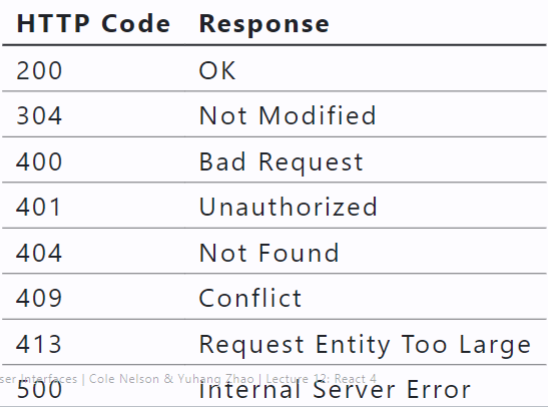
if (res.status === 409) {
alert( "This content already exists !")
}
return res.json( );
}).then(json => {
if (json.msg) {
alert(json.msg)
}
});
Memoization
Storing the result so you can use it next time instead of calculating the same thing again and again
useCallback to memoize functions
useMemo to memoize calculated values
memo to memoize components
useCallback Hook
useCallback is used to ‘memoize’ a callback function.
function MyApp() {
    const myComplicatedFunction = useCallback(() =>{
        // ...
    },[]);
    return <>
        <button onClick={myComplicatedFunction}>Click Me</button>
   </>
}
Takes a callback function to ‘memoize’ and an optional list of dependencies (e.g. when to re-‘memoize’).
Use useCallback when you need to pass a callback function as a prop to child components. By memoizing the callback, you can prevent unnecessary re-renders of child components when the parent component re-renders.
useMemo Hook
Same thing as useCallback , except memoizes the value of a callback rather than the callback itself.
Use useMemo when you have a costly computation or operation that you want to perform only when certain dependencies change. It’s useful for optimizing performance when dealing with expensive calculations or data transformations.
function MyApp() {
    const myComplicatedvalue = useMemo(() => { /* Some complex call */},[]);
return <>
        <p>{myComplicatedvalue}</p>
    </>
}
memo-ized Components
Used for creating purely functional components. Given the same props, the function renders the same output.
Use memo when you have a functional component that re-renders frequently due to parent component updates but doesn’t need to. This can be especially useful when optimizing the rendering of presentational components.
export default memo(GroceryList,(prevProps, nextProps) => {
    return prevProps.apples === nextProps.apples &&
        prevProps.bananas === nextProps.bananas &&
        prevProps.coconuts === nextProps.coconuts;
})
Software Stack
We typically refer to the “frontend” as the content that gets delivered to the user…
The Browser
However, we are constrained to what the browser can interpret…
- HTML
- CSS
- JS
We don’t deliver our JSX code, we deliver HTML, CSS, and JS generated via npm run build !
Also, specify a home page (absolute or relative)…
Build Bundle
Production Consideration
Reliability
Does our code work?
Manual testing
Automated testing
Jest
React Testing Library
Static analysis
- TypeScript: Used for type-checking
- ESLint: Used for following best practice
- TypeScript: Used for type-checking
Performance
Does our code work well?
- Be aware of the “bundle size”!
- Our code specifically…
- Perf
- Profiler
- Our code broadly…
- Google Lighthouse
- Chrome User Experience Report (CrUX)
Monitoring
Does our code continue to work well?
- Logging
- Not console.log
- Sentry
- DataDog
- Cloud Tools
- Cloud Monitoring Tools
- DownDetector
Business Value of Delivery
- Core Questions
- Are we making money?
- Are users making use of new features?
- Analysis Methods
- A/B Testing
- Customer Surveys
- Commercial Tools
- Pendo
Search Engine Optimization (SEO)
The generated HTML doesn’t have much in it!
What is a search engine crawler supposed to do?
Option: Server Side Rendering next.js
Using NPM & Node.js
The package.json specifies details about the project.
The package-lock.json specifies specific details about dependencies.
npm install installs dependencies in node_modules .
npm run dev runs your webserver w/ hot-reloading!
npm run build generates your build bundle.
Node is the runtime engine
NPM is the package manager
Other package managers such as pnpm and yarn exist.
Design Thinking
An approach: a hands-on, user-centric approach to innovative problem solving
A process: six phases:
empathize, define, ideate, prototype, test, implement
Empathize
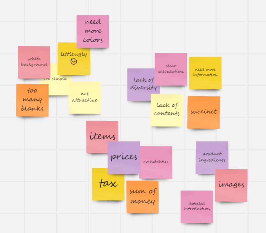
Conduct research to develop an understanding of your users.
Understanding user needs, preferences, and expectations by studying what users do, say, think, and feel.
Think-Aloud
The simplest and most powerful method for empathy
Identify representative users.
Ask users to perform representative tasks.
Observe and record what they say and do, noting obstacles, pain points, and failures.
Define
Combine all your data and derive where your users’ problems exist.
Gathering all findings — gather
Consolidating, categorizing, distilling — analyze
Translate into insight — recommend
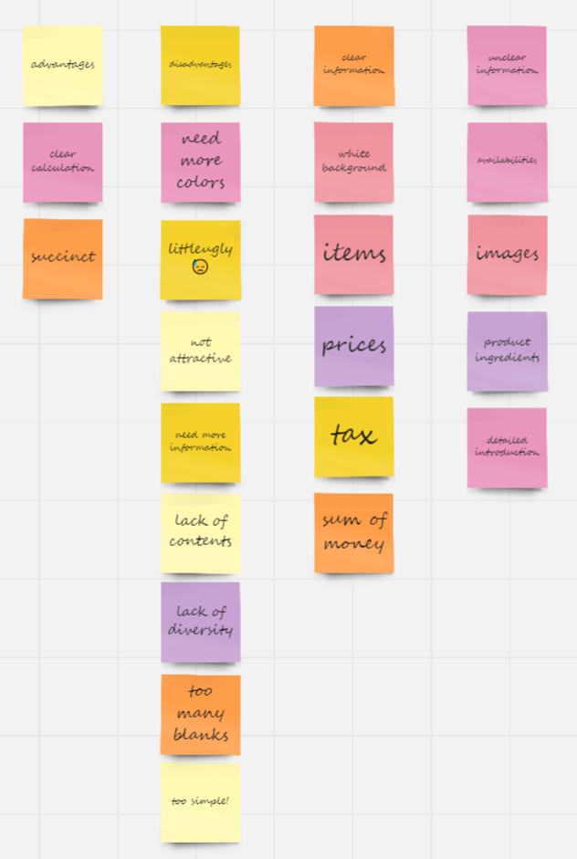
Affinity Diagramming
Definition: Organizing data into clusters based on “affinity.”
It helps you make sense of qualitative, messy data. Also known as affinity mapping, collaborative sor ting, snowballing.
Used across the board in creative, generative industries.
Step 1: Start with an initial set of categories
Step 2: Sort notes into these categories
Step 3: Add subcategories/consolidate as needed.
Step 4: Present each category
Step 5: Rank categories in severity, combining
Ideate
Definition: An active, creative, exploratory, highly iterative, fast-moving collaborative process for forming ideas for design.
Ideation can be done individually or collaboratively.
Two stages:
Idea creation → Critiquing
Key Considerations
Workspace
Team
Process
Rules of engagement
Method of capturing ideas
IDEO’s Rules of Engagement
Defer judgement.
Encourage wild ideas.
Build on the ideas of others.
Stay focused on the topic.
One conversation at a time.
Be visual.
Go for quantity.
Conceptual Design: An abstract characterization of the context, use, or experience with an envisioned design solution that highlights the main premise of the solution.
Sketching
Sketching is more effective than words for most ideas.
Quick and inexpensive sketches do not inhibit exploration.
Sketches are disposable.
Principle: Sketches should prioritize attention to detail and comprehensiveness.
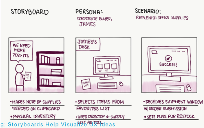
Storyboarding
Definition: A sequence of visual frames that illustrate user interaction with the envisioned system, capturing social, environmental, and technical factors that shape user experience.
Take your sketches (in context!) and impose them on a storyboard.
Visual Design
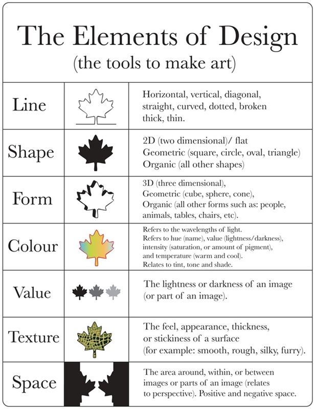
Elements of Design
Space
Definition: Space is the canvas on which visual elements are placed.
— Space can be positive or negative
— Positive: where the subject is positioned
— Negative: the space surrounding the subject
— Negative space can be used as positive
Line
Definition: The most primal design element that can divide space, call attention to, organize, and make up other elements.
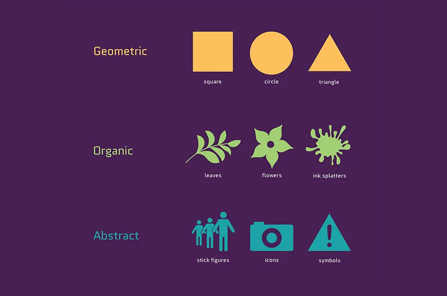
Shape
Definition: Space outlined by a contour.
— Organic vs. inorganic shapes
Size
Definition: Size, or scale, is the relative extent of the design elements such as shapes and lines.
Pattern
Definition: Pattern, or repetition, systematic duplication of other design elements such as shapes and lines.
Texture
Definition: Tactile and visual quality of a shape or space made up of different colors, materials, and different structures.
Value
Definition: The intensity in which a design element is expressed.
Visual Hierarchy
Hierarchy is a visual design principle which designers use to show the importance of each page/screen’s contents by manipulating these characteristics
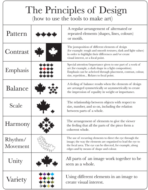
Principles of Design
Focal Point
Definition: Focal point, or the area of visual interest, is where the design directs the attention of the viewer first.
Contrast
Definition: Contrast, is the juxtaposition of design elements that strikingly differ from each other to guide user attention and action.
Balance
Definition: The organization of design elements on a canvas to provide a sense of visual balance or imbalance.
Pro Tip: Balance can be achieved through symmetry or asymmetry.
Movement
Definition: The organization of design elements in a way that suggests a particular flow on the canvas to direct the user’s attention.
Rhythm
Definition: Patterned use of design elements in a way that communicates movement or order.
Perspective
Definition: Creating a sense of horizon and movement along the depth axis of canvas.
Unity
Definition: Unity reflects the holistic consistency in the use of design elements.
Key Components for UX Design
Type
Definition: Printed letters and characters of language.
— A font is the style in which type is created.
— A typeface is a font family that includes fonts of different variations that follow the same style.
— A glyph is a particular character
Color
Definition: Human visual perception of light reflecting from an object.
— Creates emphasis
— Organizes content
— Evokes emotion
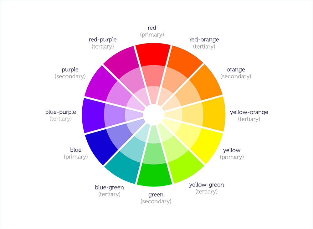
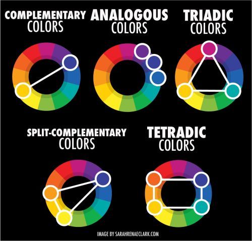
Color Palettes:
- Analogous
- Complementary
- Split Complementary
- Triadic
- Monochromatic
- Achromatic
Images
Definition: Photographs, illustrations, three-dimensional art, silhouettes, icons, dingbats, infographics, and simpler shapes that convey rich information or context.
Designing for the desktop
The WIMP Paradigm:
Windows: Windows are resizable containers of individual applications.
icons
menus
pointer
Window Structures
Primary windows contain elements for the main functionality of the application, such as a canvas. Secondary windows support main windows through modal panes, dialog boxes, Secondary windows can be docked, stacked, and floating
Menus
Menus list all the functions of the an application. Menu lists serve educational and reference purposes.
Toolbars, Palettes, Sidebars, & Tooltips: Toolbars, palettes, sidebars, and tooltips facilitate (visual and manipulation) access to frequently used functions
Toolbars, palettes, sidebars, and tooltips facilitate (visual and manipulation) access to frequently used functions
Tool Palettes: Tool palettes provide advanced con Tool palettes provide advanced con
Pointing on an application canvas enables a range of advanced capabilities for direct manipulation
Designing for the Web
Desktop applications: Dynamic, persistent screens and supporting components that enable users to perform complex tasks.
Webpages: Interconnected pages with aids that help users navigate and access a large body of content.
Web Applications: Single-page applications (SPAs) provide the functions of a desktop application on a webpage following the conventions of desktop applications
The Page: has been the building block of web content, Using primary(页眉) and secondary(页边框) navigation aids.
Primary Navigation Aids
Secondary Navigation Aids
Organizing Page Content: The Fold 折叠
Organizing Page Content: Fitting It All in,pagination页面选项,鼠标拖动infinite scroll
Search,Faceted search helps users narrow down a search once results are returned based on a simple query by providing functions to sort and filter the results.
Faceted search helps users narrow down a search once results are returned based on a simple query by providing functions to sort and filter the results. 搜索框,分类
Layout
Definition: Arrangement of visual elements on a canvas.
Layout Principles
— Creating a focal point 焦点
— Following the golden ratio 黄金分割
— Using the rule of thirds,9分3x3
— Effectively using grids 栅格
— Integrating type: The use of headlines or blocks of text to guide the user’s attention to messages.
— Placing imagery 图片
— Using negative space
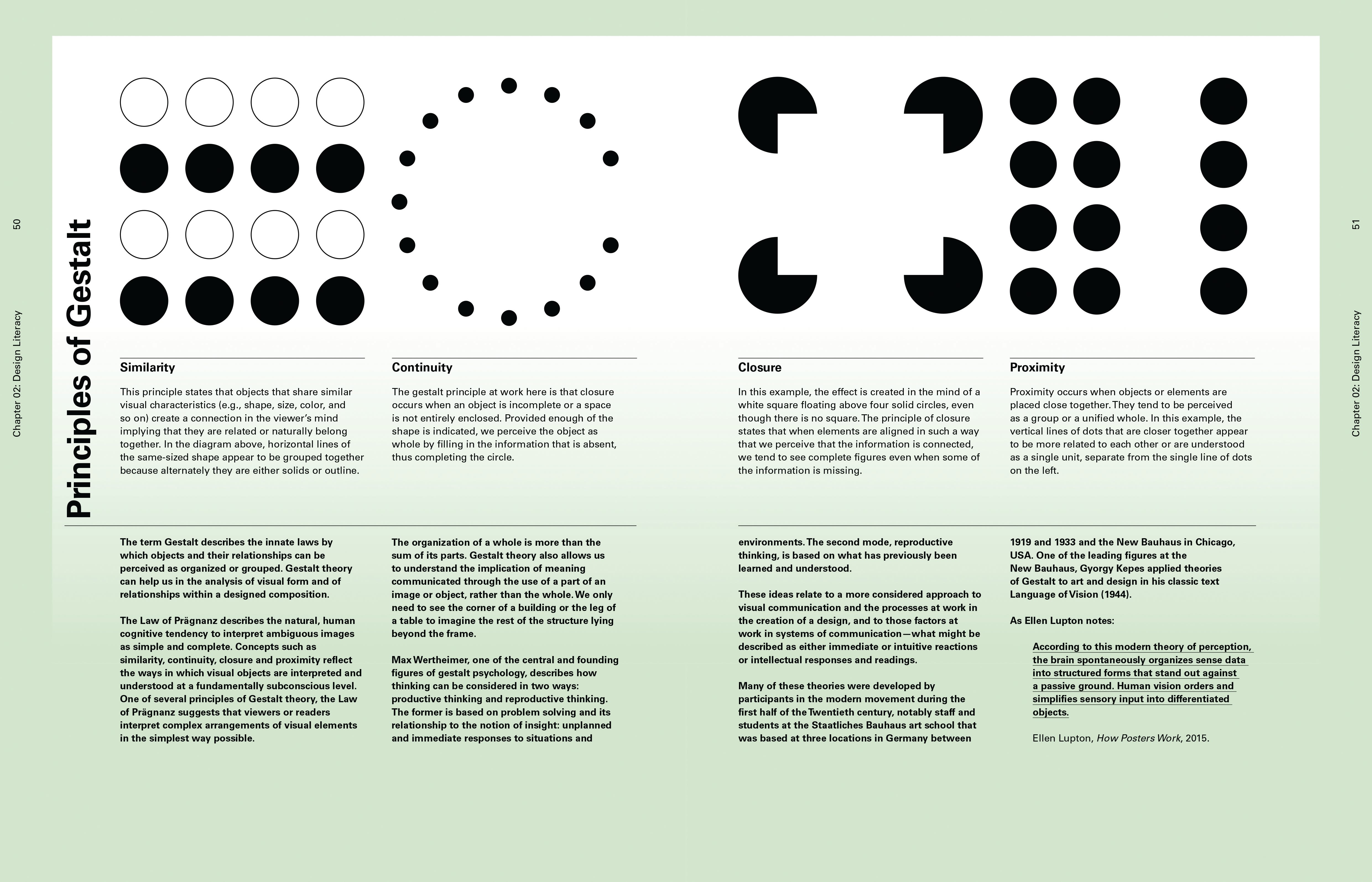
— Grouping using gestalt theory: Visual perception principles that predict how users will perceive design elements.
Includes four key principles:
- Proximity 接近
- Similarity 相似
- Continuity 连续
- Closure 封闭
— Creating visual hierarchy: Using relative positioning and sizing to communicate what design elements are more important and should be looked at first
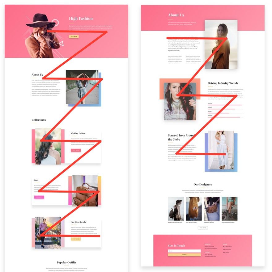
— Exploiting visual scan patterns: Designing layouts that exploit common eye-scanning patterns, e.g., the F-pattern and the Z-pattern
— Creating contrast/emphasis 对比强调
Design Pattern
Interaction Design
Interaction Structure
Definition: Defining behaviors for a system that engages the full spectrum of its user’s perception, cognition, and movements.
Five Dimensions of Interaction Design:
1D: Words
2D: Visual representations
3D: Physical objects and space
4D: Time
5D: Behavior
Interaction Paradigms
Implementation-centric
Definition: Interaction design maps directly to how system functions are implemented.
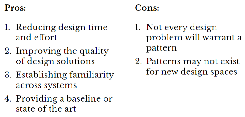
Pros:
- Very easy to build, easy to debug, easy to troubleshoot
Cons:
- Requires learning how the functions work
- Requires skills in using the functions
- The system cannot perform high-level actions
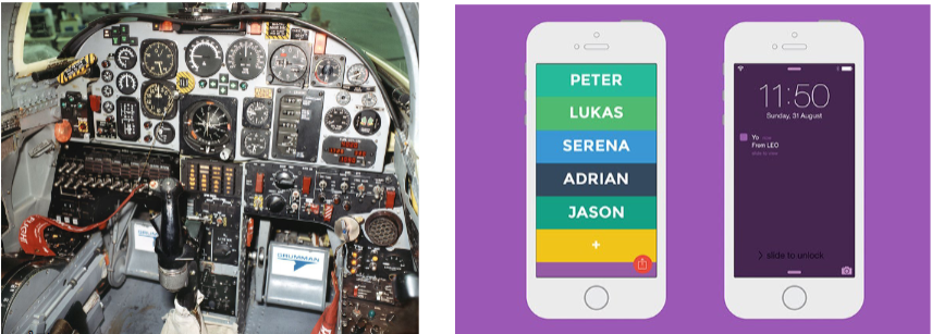
Metaphorical Design
Definition: Following a real-world metaphor that users are expected to be familiar with.
Pro Tip 1: Metaphors can be applied at different levels of abstraction.
Pro Tip 2: Mixed metaphors bring together models from different domains in a single design.
Global Metaphor:
Definition: A global metaphor provides a single, overarching framework for all the metaphors in the system (e.g., Magic Cap).
Pros: They work well in expert interfaces where the interface simulates a real-world system.
Cons: Inability to scale; lack of familiar real-world system for entirely new capabilities; cultural differences; inability to adapt as capabilities evolve.
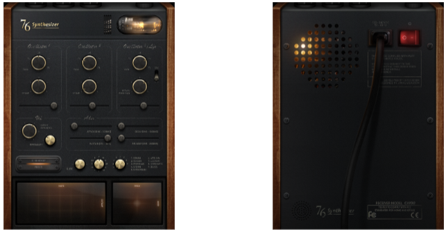
Idiomatic Design
Definition: Building dedicated, highly expressive interaction capabilities that users must learn.
Mapping cursor movements on a screen to mouse movements is an extremely successful example.
Developing Idioms:
- Primitives: atomic actions, e.g., point, click
- Compounds: complex actions, e.g., double-click
- Idioms: higher-level elements, e.g., deleting text
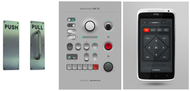
Affordances
Definition: The perceived properties of a design element that give clues about how to interact with it. Designers have borrowed the oncept from ecological psychology.
Theoretical Roots: James Gibson (1977, 1979) suggested that the human environment is structured in a way that communicates action possibilities through affordances.
Perceptible affordances enable users to intuitively recognize actions that are possible with interface elements.14
Affordances can also be hidden and false.
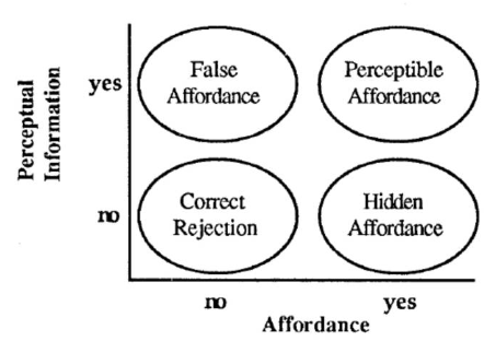
False Affordances
Definition: an action that is perceived by the user but in fact does not work as expected.
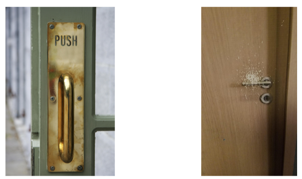
Hidden Affordance
Definition: the affordance is not too obvious.
Perceptible Affordances
Definition: an object’s characteristics imply an action.
Principles of Navigation
Wayfinding
Definition: User behavior where navigation across components follows a particular workflow or supports user goals.
Three key elements:
- Signage
- Environmental clues
- Maps, e.g., site maps
Cost
Definition: The time and effort required by users to navigate between components.
Two key principles:
- Minimize factors that increase cost of navigation: context switch, errors, delays
- Minimize travel time by minimizing number of steps and context switches
Aids
Definition: Design elements that aid users in navigating through content.
Three types of navigation aids:
- Global navigation aids, e.g., menus, tabs, sidebars
- Utility navigation aids, e.g., sign in, help, print
- Associative/in-line navigation aids, e.g., related links
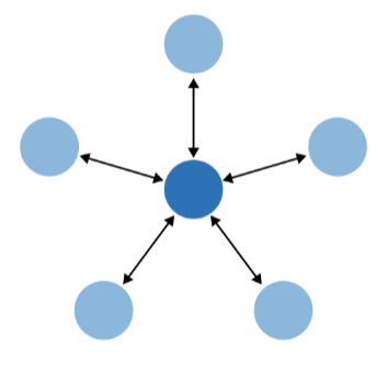
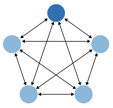
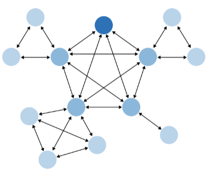
Models
Definition: Commonly used patterns of navigation through interactive applications.
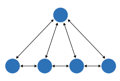
Hub & spoke
Definition: Involves a central hub, e.g., a home screen, that provides transitions to and from several specialized components.
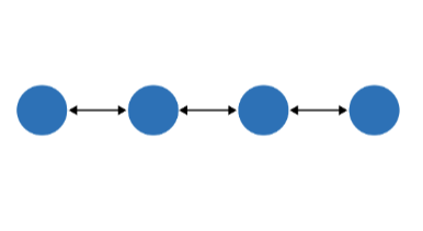
Fully Connected
Definition: A central component/page is connected to all other components that are also linked to each other.
Multi-Level
Definition: Involves main components that are fully connected with each other and sub-components that are only connected among themselves.
Stepwise
Definition: Follows a sequential or branching navigation that represents step-by-step process, e.g., checking out on an e-commerce site.
Pyramid
Definition: Similar to the stepwise model, but at each step, the user can navigate to the hub and back.
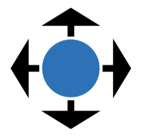
Pan-and-Zoom
Definition: Provides users with the ability to continuously navigate across a large space of content, e.g., a map, a list, or a written document.
Flat Navigation
Definition: Involves a central workspace that is always visible and functions that do not require context switches or navigation.
Modal panel
Definition: Follows the flat navigation model except for modal dialogs that are temporarily overlaid on the canvas to help the user perform specific functions.
Clear entry points
Definition: Complex applications involve navigational models with clear entry points that guide the user to frequently used or temporary functions without having to go through the hierarchical structure or a step-by-step process.
Bookmarks
Definition: Bookmarks allow users to conveniently navigate to a point of his choice, anytime he wants, even if it’s deep inside a navigational structure. These give people a way to avoid traversing many links to get to a desired page or state.
Escape Hatch
Definition: An “escpape hatch” provides users with the ability to go back to the main component/page in a complex structure without having to trace steps back.
Accessibility
Usability: The effectiveness, efficiency, and satisfaction with which a specified set of users can achieve a specified set of tasks in a particular environment.
Accessibility: The usability of a product, service, environment, or facility by people with the widest range of capabilities.
Accessibility is the extent to which an interactive product is accessible by as many people as possible.
The primary focus of accessible design is making systems accessible to individuals with disabilities.
Disability
Definition: A disability is any condition of the body or mind (impairment) that makes it more difficult for the person with the condition to do certain activities (activity limitation) and interact with the world around them (participation restrictions).
Impairment
in a person’s body structure or function, or mental functioning (e.g., loss of a limb, loss of vision, or memory loss)
Sensory Impairment
Involves impairment in one or more senses, such as loss of vision or hearing.
Involves loss of function to one or more parts of the body, e.g., congenitally or after stroke or spinal-cord injury.
Cognitive Impairment
Includes cognitive deficits, such as learning impairment or loss of memory/cognitive function due to aging or conditions such as Alzheimer’s disease.
— Visual
- Impairments in vision, including low vision, blindness, and color blindness.
— Motor/Mobility
- Muscular or skeletal impairments in the hands or arms that affect user input as well as impairments that affect mobility, where users are in a wheelchair or bedridden.
— Auditory
- Deficits that affect hearing at different levels of severity, including deafness.
— Seizures
- Neurological impairments, such as photosensitive epilepsy, that result in sensitivity to light, motion, and flickering on screen, which might trigger seizures.
— Cognitive/Learning
- Congenital, developmental, and traumatic (e.g., traumatic brain injury) conditions that result in cognitive or learning challenges.
Impairments can vary in severity or structure depending on the source and nature of the impairment.
Severity: Children with cerebral palsy can have basic mobility or completely depend on a caretaker.
Structure: Vision impairments can include color blindness, peripheral-only vision, no light perception
Types of Impairment
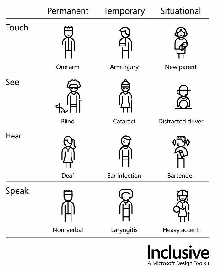
Permanent impairment: Congenital or long-term conditions, such as color blindness, missing body parts, etc.
Temporary Impairment: Impairments that improve over time, such as recovery after illness or accidents, e.g., a broken arm.
Situational Impairment: Impairments introduced by context, such as environments with low light or noise.
Accessible Design
Medical Model
Disability as personal attribute
In the context of health experience, a disability is any restriction or lack of ability (resulting from an impairment) to perform an activity in the manner or within the range considered normal for a human being.
Social Model
definition: People are disabled by barriers in society, not by their impairment or difference.
Disability as context dependent
Disability is not just a health problem. It is a complex phenomenon, reflecting the interaction between features of a person’s body and features of the society in which he or she lives.
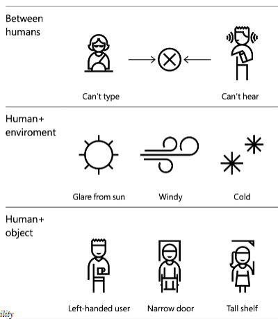
Context-dependent disability results from a mismatch between abilities and the environment:
Ability + Context = Disability
Universal Design
Definition: The design of products and environments to be usable by all people, to the greatest extent possible, without the need for adaptation or specialized design.
Equitable use
The design is useful and marketable to people with diverse abilities.
- Provide the same means of use for all users: identical whenever possible; equivalent when not.
- Avoid segregating or stigmatizing any users.
- Provisions for privacy, security, and safety should be equally available to all users.
- Make the design appealing to all users.
Flexibility in Use
The design accommodates a wide range of individual preferences and abilities.
- Provide choice in methods of use.
- Accommodate right- or left-handed access and use.
- Facilitate the user’s accuracy and precision.
- Provide adaptability to the user’s pace.
Simple and Intuitive Use
Use of the design is easy to understand, regardless of the user’s experience, knowledge, language skills, or current concentration level.
- Eliminate unnecessary complexity.
- Be consistent with user expectations and intuition.
- Accommodate a wide range of literacy and language skills.
- Arrange information consistent with its importance.
- Provide effective prompting and feedback during and a”er task completion.
Perceptible Information
The design communicates necessary information effectively to the user, regardless of ambient conditions or the user’s sensory abilities.
- Use different modes (pictorial, verbal, tactile) for redundant presentation of essential information.
- Provide adequate contrast between essential information & surroundings.
- Maximize “legibility” of essential information
- Differentiate elements in ways that can be described (i.e., make it easy to give instructions or directions).
- Provide compatibility with a variety of techniques or devices used by people with sensory limitations.
Tolerance for Error
The design minimizes hazards and the adverse consequences of accidental or unintended actions.
- Arrange elements to minimize hazards and errors: most used elements, most accessible; hazardous elements eliminated, isolated, or shielded.
- Provide warnings of hazards and errors.
- Provide fail safe features.
- Discourage unconscious action in tasks that require vigilance.
Low Physical Effort
The design can be used efficiently and comfortably and with a minimum of fatigue.
- Allow user to maintain a neutral body position.
- Use reasonable operating forces.
- Minimize repetitive actions.
- Minimize sustained physical effort.
Size and Space for Approach and Us
Appropriate size and space is provided for approach, reach, manipulation, and use regardless of user’s body size, posture, or mobility.
- Provide a clear line of sight to important elements for any seated or standing user.
- Make reach to all components comfortable for any seated or standing user.
- Accommodate variations in hand and grip size.
- Provide adequate space for the use of assistive devices or personal assistance.
Assistive Technologies
Definition: Specialized tools that close accessibility gaps.
Screen Readers
Screen Magnification
Text Reader
Braille for the Web: A mechanical device that translates textual content on the screen into Braille.
Alternative Input Devices: Head/mouth wands/pointers, Motion/eye tracking, Single-switch
Head/mouth wands/pointers
Motion/eye tracking
Single-switch
Speech input
Alternative & Augmentative Communication
React Native
Mobile Development
Building specifically for the device (e.g. Android or iOS) that you want to support.
iOS: Objective-C or Swift w/ Cocoapods
Android: Java or Kotlin w/ Maven or Gradle
Pros
- Organic User Experience
- Optimized Apps
- Fine-Grained Control
Cons
- Expensive
- Little Code Reuse
- Less Sense of Abstraction
Basis
Definition
A JS framework for building native, cross-platform mobile applications using React, developed by
Facebook in 2015.
Unlike ReactJS, which was a library, React Native is a framework that includes everything* that we will need to build mobile applications.
React Native supports iOS and Android development.
No more browser! No more DOM!
Hermes is used to translate your JS components to iOS/Android components
Same:
- Using NPM for our library management
- Using complex APIs
- Core React features
- React Hooks (useEffect, useState, etc.)
- Passing props and state management
- Controlled vs Uncontrolled Inputs
- Memoization
Styling
Because React Native does not use a “browser”, we can’t use CSS styles. Instead, we create JavaScript stylesheets.
const styles = StyleSheet.create({
    container: {
        flex: 1,
        justifyContent: 'center',
        backgroundColor: '#ecf0f1',
        padding: 40,
    },
});
Images
Image not img (must be imported!)
Must specify a width and height: the default is 0!
source not src which takes an object (not a string)
Buttons
Two minor changes…
titleis specified with a proponPressrather thanonClick
<Button title="Speak!" onPress={doSpeak}/>
Cross-Platform
React Native provides a number of components that utilize platform capabilities that may not be available in other platforms, thus for cross-platform development, we need to utilize multiple platform-specific components.
By Platform:
TouchableNativeFeedback only works on Android; a similar effect can be achieved usingTouchableHighlight on iOS.
By Size:
Mobile devices vary significantly in screen size, and we open need to obtain screen dimensions of the device using the Dimensions class in react-native.
const getscreensize = () => {
    const screenwidth = Math.round(Dimensions.get('window').width);
    const screenHeight = Math.round(Dimensions.get('window').height);
    return { screenwidth: screenwidth, screenHeight: screenHeight });
}
Compoents
Switch
A Switch is on or off.
valueboolean value of on/offonValueChangecallback function
ScrollView
Like a View , but scrollable! Make sure that it is in a view that is flexible.
{ /* A bunch of content here!*/ }
Card
React Native does not have the concept of a “card”…
Use a third-party library like
react-native-paper.Create our own component!
Pressable:
export default function BadgerCard(props) {
    return

        {props.children}
Card:
{props.title}
Animation
Providing feedback in a visually aesthetic way. May also consider using a third-party-library like react-
native-reanimated.
Animated provides animations for…
ViewTextImageScrollViewFlatList(similar to a ScrollView)SectionList(similar to a ScrollView)
… e.g. <Animated.View>{/* ... */}</Animated.View>
These are animated using…
Animated.timingAnimated.springAnimated.decay
… which manipulate anAnimated.Value
Animated.timing(opVal, {
    tovalue: 1,
    duration: 10000,// in ms
    useNativeDriver: true // must include
})
Animated
Animated.Value is used in combination with useRef
const opVal = useRef(new Animated.Value(0)).current
useEffect(() => {
    Animated.timing(opval,{
          toValue: 1,
        duration: 10000,
        useNativeDriver: true
    }).start() // don't forget this !
},[])
Can control many animations using…
Animated.parallel
useEffect(() => {
    Animated.parallel( [
        Animated.timing( height,{
            toValue: 800,
            duration: 10000,
            useNativeDriver: false,// cannot use native driver for height/width!
     }),
    Animated.timing(width,{
        toValue: 500,
        duration: 10000,
        useNativeDriver: false,
        })
    ]).start()
},[]);
Animated.sequence
useEffect(() => {
    Animated.sequence([
        Animated.timing(sizeval,{
            tovalue: 500,
            duration: 10000,
            useNativeDriver: false,
        }),
    Animated.timing(sizeval,{
        toValue: 0,
        duration: 100e0,
        useNativeDriver: false,
      })
    ]).start()
},[]);
Animated.loop
useEffect(() => {
    Animated.loop( //not an array !
        Animated.sequence([
            Animated.timing(sizeval,{
                toValue: 500,
                duration: 10000,
                useNativeDriver: false,
          }),
        Animated.timing(sizeval,{
            toValue: 0,
            duration: 10000,
            useNativeDriver: false,
         })
        ])
    ).start()
},[]);
start() and stop() apply to the set of animations
You cannot directly add/subtract/multiply/divide Animated.value. Instead, you must use…
Animated.add(v1, v2)Animated.subtract(v1, v2)Animated.multiply(v1, v2)Animated.divide(v1, v2)
Navigation
Basics
Must be nested inside of a NavigationContainer
Create navigators via a function createNAVIGATOR() e.g. createBottomTabNavigator()
Navigators consist of a navigator and a set of screens
useNavigation is a custom React hook that can be used to help us navigate
Supports navigate , reset , goBack among others
Information can be passed from screen to screen via route params (see Native Stack Navigator example)
Navigators can be styled
Navigators can be nested
Tab Navigation
const socialTabs = createBottomTabNavigator();
Drawer Navigation
const SocialDrawer = createDrawerNavigator( );
Stack Navigation
const BookStack = createNativestackNavigator();
Can push a screen onto the history stack via navigation.push(screenName, params)
screenNameis the name of the screen to navigate to, e.g.Bookparamsis an optional object of parameters to pass to the receiving screen.paramsis recieved asprops.route.params
Nested Navigation
Navigators can be nested.
- Stack in Tabs
- Stack in Drawer
- Stack in Tabs in Drawer (e.g. Example Below)
- Stack in Stack in Tabs
- Stack in Stack in Stack in Stack in Stack
Make use of the headerShown option!
Passing data
<
    ToolDrawer.Navigator>

    {
        tools.map(tool => {
            return
                {(props) => }

        })
    }
Switch Navigation
There is a fourth, “informal” navigation.
issignedIn ? (
    <>


) :(
    <>


);
Premise: perform a conditional render.
If the user is signed in, show them their needs feed.
Else give the user the option to sign in or sign up.
Modal
What you need…
- Something to open the modal
- Some content inside the modal
- Something to close the modal
We often manage whether the modal is open or closed using a state variable
const [modalvisible, setModalvisible] = usestate(false);
A modal is nothing more than a secondary overlay.
Properties
animationType: ‘slide’, ‘fade’, ‘none’onShow: callback funconRequestClose: callback functransparent: true/falsevisible: true/false often handled by a state variable
Accessibility
accessible attribute indicates whether the component is an accessibility element and, if so, groups its children in a single selectable element.
The accessibilityLabel attribute defines the screen reader description of the component whereas theaccessibilityHint attribute helps the user understand what will happen if they perform an action.
welcome to Find My Badgers!
Secure Storage
JSON Web Token
HeadereyJhbGciOiJIUzI1NiIsInR5cCI6IkpXVCJ9
{"alg": "HS256", "typ": "JWT"}
ClaimseyJpZCI6MjgsInVzZXJuYW1lIjoidGVzdDEyNDU2NyIsImlhdCI6MTY5OTkxNDQxMiwiZXhwIjoxNjk5OTE4MDEyfQ
{"id": 28, "username": "test124567",
"iat": 1699914412, "exp": 1699918012 }
SignatureZ0WiskxiQUTzEhHocjzg4y5QaFEOCgg4Zz8sLszSMB0
Signed using alg with some server secret.
Secure storage is asynchronous in nature.
getItemAsync(key)setItemAsync(key, val)deleteItemAsync(key)
Authentication
JWT is just one form of authentication, known as stateless authentication.
Session UUIDs are another popular way to handle authentication, e.g.
Web Development
Interface with the user’s browser.
Prefer
HTTP-Onlycookies.
Mobile Development
Interface with the user’s operating system.
Prefer OS-level secure encrypted storage.
Mobile: Specify…
- header
Authorization - value
Bearer <JWT>
fetch( "" https://example.com/api/submit", {
      method: "POST",
    headers: {
        "Authorization" : "Bearer eyJhbGci0iJIUzI1NiIs..."
      //...
If the request has a body, don’t forget Content-Type
Gestures
React Native provides methods to detect when and where the user’s fingers move.
Higher-level gesture response libraries…
react-native’s Button onPress
react-native-paper’s Card onPress and onLongPress
react-native-elements’ Slider onSliding
react-native-maps’ Marker onDrag
react-navigation’s Drawer gesture
Sensors
Use expo-sensors instead of react-native-sensors
- Accelerometer
- Barometer
- Gyroscope
- LightSensor
- Magnetometer
- Pedometer
Humidity noob air pressure/movement/light is ok
Other Sensors
expo-cameraexpo-batteryexpo-hapticsexpo-avexpo-brightness
Deployment
Use Expo Application Services (EAS)
An .apk gets deployed to the Google Play Store
An .ipa gets deployed to the iOS App Store
App goes through a review process.
- Google Play Store: Hours to Days
- iOS App Store: Days to Weeks
Deployment Considerations
- Reliability
- Performance
- Monitoring
- Business Value of Delivery
- App Store Optimization (ASO)
DialogFlow
Voice User Interfaces
VUIs are a common form of agent-based design as opposed to direct manipulation.
Conversational interfaces can be used to…
→ Address accessibility needs
→ Address context-specific problems (e.g. driving)
→ Augment the user experience
VUIs integrate a number of technologies and ideas…
- Speech recognition
- Spoken language understanding
- Dialog management
- Response generation
- Text-to-speech synthesis
Agents
Agents are high-level containers for a number of building blocks…
- Agent settings
- Intents
- Entities
- Integrations
- Fulfillment
Intents
The goals of the user that are expressed to the agent.
Consists of training phrases, parameters (optional), and responses.

Training Phrases: Things the user may say to express an intent. DialogFlow recommends having many!
Parameters: Things that may vary in an expression, e.g. time, quantity, location.
Responses: How the system responds to the expression. Can include text, buttons, links, etc!

Fallback Intent
A special type of intent that dictates how the agent responds if an expression cannot match an intent.
e.g. “Sorry, I didn’t get that.”
Parameter: A variable to be expressed by the user
Entity Type: The type of variable expressed
Entity: A specific value that can be expressed
ex:
What is the weather like today in Seattle?
- Intent: weather inquiry
- Parameter city name
- Entity Type: geolocation
- Entity: Seattle
Activity
Identify intents, parameters, and entity types of parameters in the following training phrases. Then, identify possible entities and write potential responses.
Entities
Entities can have synonyms, e.g. green onions are also known as spring onions or scallions.
Entities can be fuzzy-matched, e.g. gween onion is probably misspelled green onion.
Entities can be automatically expanded, e.g. if saw and hammer are tools, drill likely is too.
Webhook Fulfillment
Doing something “smart” with our agent.
Many reasons to use webhook fulfillment…
- Used instead of giving static responses.
- Interact with backend APIs and databases.
- Provides the business logic for the agent.
Intent Mapping
const intentMap = {
    "GetNumUsers" : getNumUsers,
    "GetNumMessages" : getNumMsgs,
    "GetChatroomMessages" : getchatMsgs
}
app.post( '/', (req,res) =>{
    const intent = req.body.queryResult.intent.displayName;
    if (intent in intentMap) {
        intentMap[intent](req,res );
    }else {
        console.error( ` could not find ${intent} in intent map!`)
        res.status(404).send( SON.stringify({ msg: "Not found! " }));
    }
})
Responding to Request
Card
function getNumUsers(req,res) {
    //TODO Fetch data from API
    res.status(200).send({
    fulfillmentMessages: [
    {
        card: {
        title: "Hello",
        subtitle: "world",
        buttons: [
        {
            text: "Click Me",
            postback : "https://example.com/"
        }
       ]
     }
    }
    ]
 });
}
Text
function getNumUsers( req,res) {
    //TOD0Fetch data from API
    res.status ( 200) .send({
    fulfillmentMessages:[
    {
    text: {
        text:[
            `Hello from getNumUsers!`
        ]
       }
      }
     ]
    });
}
Async
Definition: not happening or done at the same time.
We promise something will happen in the future.
If we fulfill our promise, then we do something. Otherwise, we catch and handle the error.
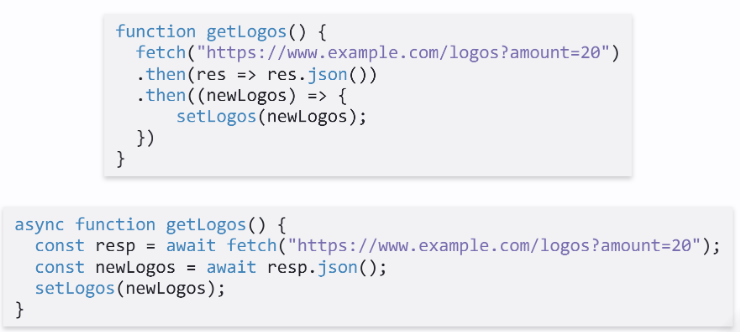
async / await
equivalent way to handle asynchronous behavior
await must be inside of an async function or at the top-level of the program
await waits for right-hand-side to complete
every async function returns a Promise
a synchronous function may spawn async behavior
an async function always happens asynchronously
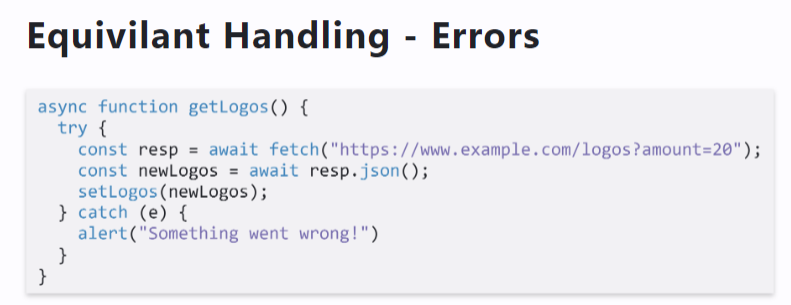
Equivilant Handling!
Errors
Context
The training phrase “My balance” only makes sense in the context of CheckingInfo.
Intents have input and output contexts.
A context has a lifespan. The lifespan may be defined in terms of time or turns.
A context can be added or removed by an intent.
Events
Events are triggered by actions users take on platforms that Dialogflow interacts with, such as Google
Assistant, Slack, and Facebook Messenger.
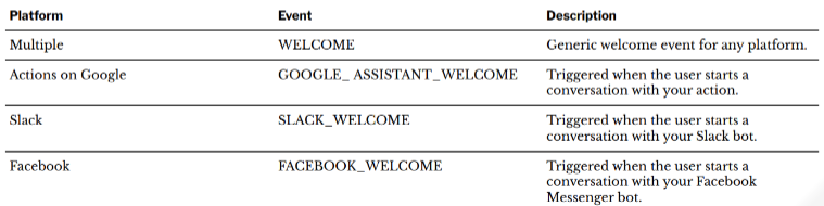
Integrations
DialogFlow agents can be integrated with other platforms such as Google Assistant, Slack, and Messenger.
Can also be embedded as an iframe …
SmallTalk is used to provide responses to casual conversation.
Prototyping
Definition: Building a draft or an early version of a product or system in order to explore, demonstrate, and test design ideas for a part or the entirety of the product or system.
Prototyping Methods
Paper Prototyping
Definition: Mocking up design ideas by sketching pages/screens with design elements using
design supplies (e.g., paper, pencils, markers, scissors, glue, tape) and simulating how the
envisioned system would respond to user input by swapping different pages/screens and moving/changing design elements.
Wireframes
Definition: Lo-fi prototypes of the makeup of a design in terms of its structural components. Wireframes can be hand-drawn or digitally created.
Most useful in the early-to-mid stages of the design process.
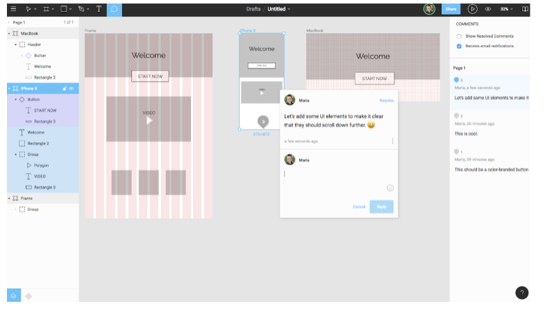
Annotations
Definition: Labels, explanations, and notes that provide further information on the goals, content, and functioning of the design elements illustrated on wireframes.
Key in addressing the problem of interpretability of simplified designs for all stakeholders.
Interactive prototyping
Definition: Creating realistic prototypes of the navigation or structural components (or both) of the
design idea by creating a series of screens/pages with design elements, linking these screens/pages for navigation, and simulating the transitions between screens/pages.
Native prototyping
Definition: Implementing and testing design ideas on the target technology platform of the design.
Prototyping Theory
Three-dimensional Model of Prototyping
Prototypes represent three dimensions of a design idea:
- Role
- Look and feel
- Implementation
Each dimension can be represented at various levels of fidelity.
Their integration makes a working prototype or a pre-alpha product.
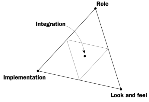
Dimension 1: Role
Definition: Represents the functions that the system serves in the user’s life, i.e., how the system is useful to them.
Dimension 2: Look and Feel
Definition: Simulates the sensory experience of the user while using the system, i.e., what the user sees, hears, and feels during use.
Dimension 3: Implementation
Definition: Includes the technical capabilities that enable the system to perform its function, i.e., the low-level details of how the system works.
Dimensions Combined: Integration
Definition: Represents the complete user experience with the system as envisioned in the conceptual design.
Prototyping Scope
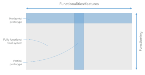
Consider the space of features and functioning as everything that a system does.
Horizontal Prototype: Provides a broad view of the entire system and focus on the user interaction rather than the functionality.
Vertical Prototype: Focuses on a single feature/functionality and provides the full functioning of that feature.
Prototyping Strategies
Throwaway prototyping
Definition: Rapid prototyping to explore design ideas, demonstrate feasibility, communicate with stakeholders, and test the ideas with users and eventually discarding the prototype instead of further developing the model into a final product.
Most lo-fi and paper prototypes are throwaway prototypes.
Throwaway prototyping is usually combined with sketching.
Evolutionary prototyping
Definition: Also called breadboard prototyping, the design team incrementally builds prototypes of a design idea, tests the idea with users, and refines the prototype until it reaches the desired level of maturity.
Most products we use are evolutionary prototypes that went through alpha, beta, etc. phases.
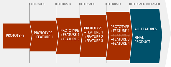
Incremental prototyping
Definition: Dividing system functionality into slices (vertical prototypes) based on design specifications and incrementally building each slice that is then integrated into the overall system.
Appropriate for large and complex projects.
Extreme prototyping
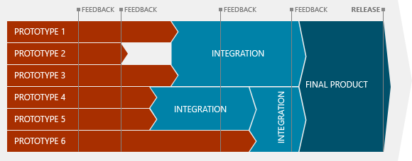
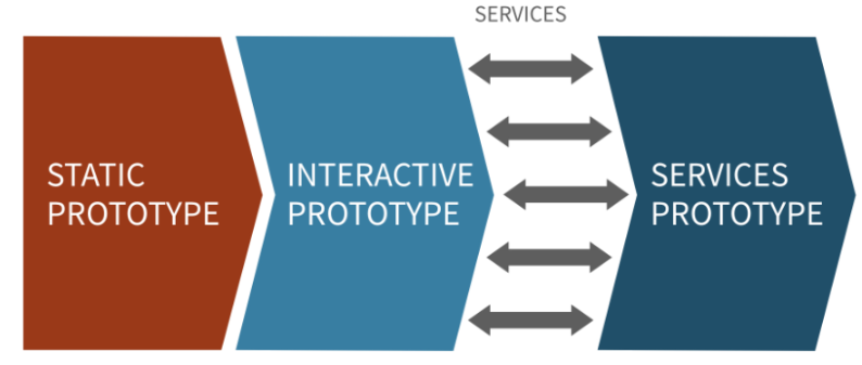
Definition: Breaking down the development into three phases that build on each other: (1) building a static prototype, (2) building fully functional, interactive components that will simulate services, and (3) finally implementing the services.
Enables rapid and parallel prototyping, testing, and refinement by removing dependencies between different components of a system or between the system and third party services.
Fidelity in Prototyping
Definition: The level of detail in which a design is represented in the prototype.
Two ends of a fidelity spectrum:
Low-fidelity (lo-fi) prototyping
High-fidelity (hi-fi) prototyping
Why important?
The more “done” the prototype looks, the narrower the feedback will be; and vice versa.
This is just an idea. I’m not done!
As a principle, use no higher resolution than is necessary.
Advantages of lo-fi prototyping:
- Has lower development cost
- Prevents designers from prematurely wedding to
specific design ideas - Enables exploring, communicating, and testing of
conceptual designs - Helps designers identify structural, navigation, and
organizational issues - Allows rapid evaluation of multiple design ideas
Limitations of Lo-fi Prototyping
- Requires a facilitator to drive the prototype during testing and communication
- Offers limited ability to identify breakdowns in design
- Lacks sufficiently low-level specifications for development
- Provides limited sense of feasibility
Various methods, approaches, and strategies for prototyping
Criteria for choosing the right method:
— Design team goals
— Capabilities and resources
— Available time for prototyping
Mobile Design
Mobile Input
Mobile devices have unique capabilities, including input and sensing, that expand possibilities for interaction.
Mobile input primarily centers around the use of touch-sensitive screens that offer two capabilities: direct manipulation input and multi-touch gestures.
Direct Manipulation Input: In web and desktop interfaces, direct manipulation input involves mouse or trackpad input that is mapped to the screen using a relative mapping. On mobile devices, this mapping is absolute, and the user directly interacts with screen elements.
Multi-touch Gestures
Mobile input method include a number of idiomatic gestures dedicated to specific functions.
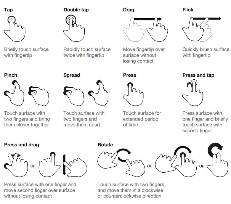
In scrolling, swiping vertically scrolls through large amounts of content, and swiping horizontally scrolls through carousels, opens drawers, and navigates to the previous/next screen.
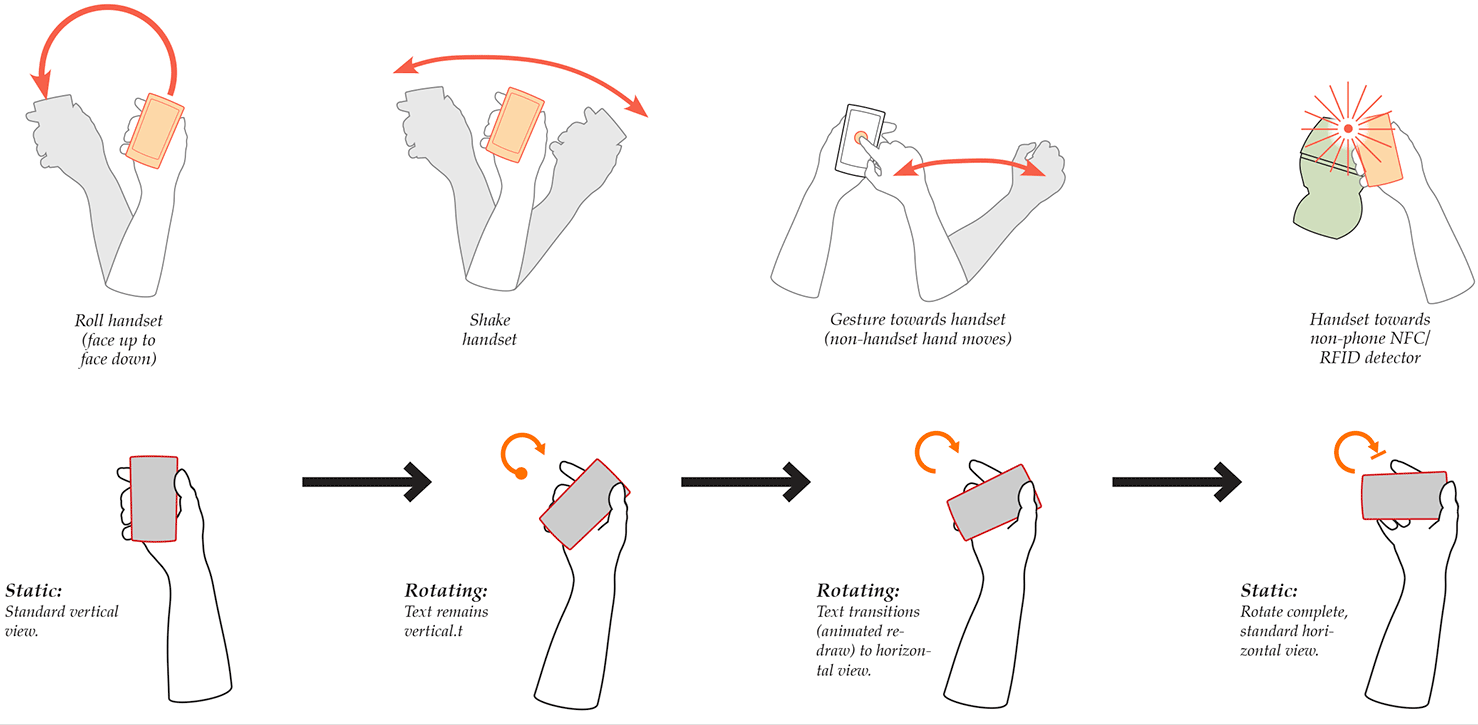
Motion Gestures
Definition: Gestures that involve moving the mobile device in specific ways, e.g., shaking to enable/disable silent mode. These gestures are usually application specific or customizable at the OS level.
Microinteractions
Definition: Microinteractions are contained product moments that revolve around a single use case.
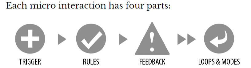
Trigger
Definition: Events that initiate the microinteractions. Triggers can be manual/user-initiated or automatic/system-initiated.
Manual triggers involve intentional and explicit interaction with the system, e.g., by flipping a switch, pressing a button, speaking to the system.
Automatic triggers occur when certain conditions are met, ,e.g., chime when a new text message arrives, silence the phone a!er 10 pm.
Rules
Definition: Rules determine what happens (and doesn’t happen) in the system when a microinteraction is triggered.
Feedback
Definition: Information that the user sees, hears, or feels to reflect what is happening.
Feedback can take many forms:
visual, aural, haptic, etc.
Loops & Mode
Definition: Meta-rules that, depending on context, change microinteraction rules and feedback (e.g., “snoozing” a reminder; chime/vibration feedback when silent mode is off/on).
Loops determine the length of the micro interaction and whether the interaction repeats (e.g., related beeping when you leave the fridge door open) or changes over time (e.g., microwave oven reminder to pick up food changing over time).
Modes switch the functioning or operation of the system. E.g., “do not disturb” mode that changes system behavior.
Pro Tips: Minimize the scope of the microinteraction and make sure that it doesn’t turn into a feature. Best microinteractions support single task, single action.
Simpler way of thinking about microinteractions is action-feedback pairs for a single purpose.
Mobile Design Patterns
Mobile platforms are highly constrained design environments. Mobile design patterns help designers overcome these limitations by expanding capabilities for input, display, and navigation.
Stacks
Usage: Used to vertically organize design elements such as a toolbar, content panes, and a navigation bar to maximally utilize the vertical space in mobile devices.
竖直利用率
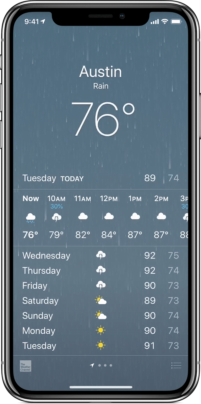
Screen carousels
Usage: Full-screen content panes that can be placed on a horizontal array to display different instances of the same kind of information, such as weather information for different cities.
水平滑动来浏览
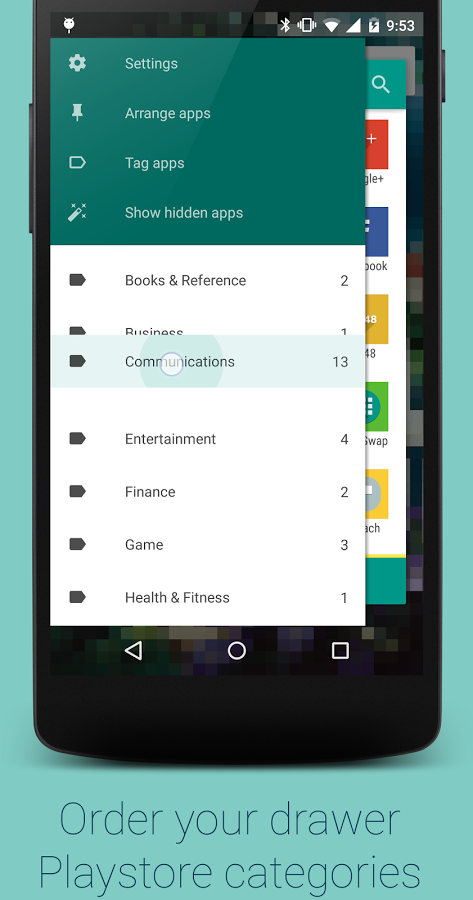
Drawer
Usage: Drawers provide links for navigation or controls for the various settings of the application.
Lists & Grids
Usage: Lists involve vertically stacking a large number of items, including text, controls, and thumbnails, and supporting navigation through vertical scrolling.
Grids involve a large continuous grid or multiple panes of grids that users can scroll through vertically or horizontally.
Grids are more commonly used for information with more visual content, such as media thumbnails, icons, and photos.
网格布局
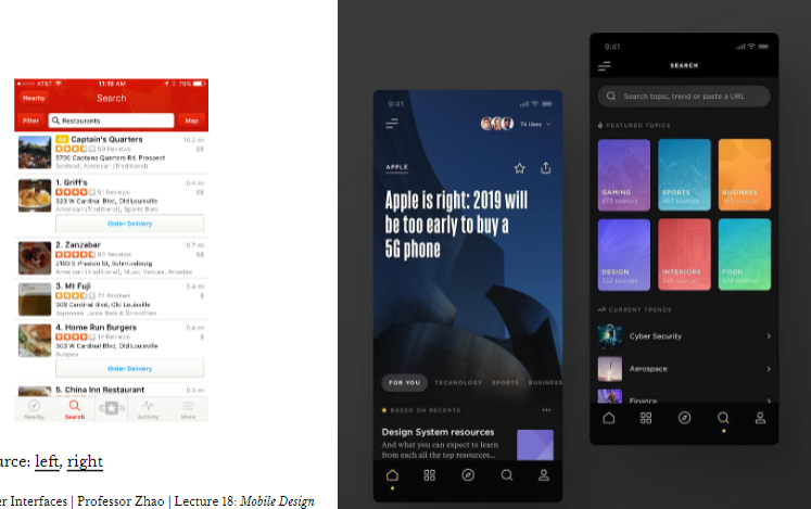
Carousels
Usage: Content carousels provide a row of content items including images or textual cards that users can navigate through by swiping left and right.
Swimlanes
Usage: Swimlanes are stacked content carousels that each show a row of items, enabling visual browsing through several different lists with minimal navigation.
list + carousels

Card
Usage: Cards are little rectangles full of images and text that serve as entry points to more detailed information. They can be organized by lists and grids, but they put together different compositions of multimedia content, including images, text, and links, on a column, row, or grid that users navigate through by swiping horizontally and vertically.
ex: ipad ios store
Bars
Usage: These are vertical or horizontal strips containing buttons or tabs dedicated to different components or tools.
Tab bars that are placed at the top, bottom, or the side of the screen enable navigation between different components.
Bars can also serve as toolbars to activate various application or operating-system-level functions.
Bars help navigation by linking to previously viewed content or to view the previous/next item among multiple screens.
侧边栏和底栏
Search, sorting, filtering
Usage: Used to enable search and filtering to navigate through a large body of content that may be
distributed across the entire navigation structure of the application.
These patterns usually provide a search box to enter a search query either by typing text, voice input, or selecting from among a history of searches.
搜索框
Landing pages, guided tours
Usage: Includes a landing, welcome, or home screen that can serve as a portal to the most frequently used functions or as a guide to the next action in the task.
This pattern can also serve as guided tours for new users or serve as help screens by overlaying instructions or tooltips on the screen.
新手指南-> 导航页面
Advanded Direct Manipulation
Usage: Applications, such as image editors, drawing or presentation tools, or media players, enable direct- manipulation-based controls for content creation or editing.
These patterns provide customized user-input methods, such as control handles for object manipulation or scrollbars to navigate through video content.
高级编辑控制功能
Panes and panels
Usage: Multi-pane structures and pop-up panels and tools are commonly used in tablets to provide secondary application windows in a way that’s similar to desktop applications.
AR/VR
Usage: Augmented and virtual reality, a.k.a. mixed reality, are used to overlay objects or information on images or video of the user’s real environment that is captured using the mobile device’s camera.
混合现实
Experience Prototyping
Introduction to Conversational Interface
Definition: “Technology that supports conversational interaction with these VPAs [virtual personal assistants] by means of speech and other modalities.”
Conversational interfaces integrate a number of technologies:
— Speech recognition
— Spoken language understanding
— Dialog management
— Response generation
— Text-to-speech synthesis
Design Principles for Conversational Interfaces
Definition of Usability: The effectiveness, efficiency, and satisfaction with which a specified set of users can achieve a specified set of tasks in a particular environment.
Conversational interfaces are almost always less effective, less efficient , and less satisfactory than graphical user interfaces.
Effectiveness: Conversational interfaces are more error prone due to technology, ambiguities, and environmental influences.
Efficiency: Using conversational interfaces is almost never as fast as using graphical user interfaces.
Satisfaction: Interacting with conversational interfaces an be awkward, socially inappropriate, and frustrating.
Where to use:
Streamlining app installation, login, payment, notifications, and and so on in a conversational paradigm.
In some contexts, e.g., while driving, CIs are more effective, efficient, and satisfactory due to resource constraints.
CIs address many accessibility problems, including vision (e.g., blindness), motor (e.g., tremor), and cognitive (e.g, dyslexia) deficiencies.
Design Principles
Gricean Maxims
Definition: Proposed by Paul Grice, conversations follow the cooperative principle and four key maxims:
- Maxim of quality
- Maxim of quantity
- Maxim of relevance
- Maxim of manner
Multimodality
Definition: Multimodal interfaces utilize multiple modalities, including visual information, speech, touch, and so on, in user experiences they afford.
Most conversational interfaces are multimodal interfaces.
Multimodality Principle: Take advantage of other modalities, e.g., visual information, vibrations, etc., wherever appropriate.
Using multimodal components, you can provide users with breaks for decision making, interruptions, etc.
Interaction Paradigm
Conversational interfaces can follow different paradigms depending on the context of use and the design of the application:
- Command-and-control interfaces
- Conversational interfaces
Command-and-control interfaces
Definition: Interfaces where speech input is mapped to specific system functions that are called immediately.
- Expressing user intent using a wake word
- Indicating listening and understanding
- Executing the mapped function
语音声控?
Conversational Interfaces
Definition: Interfaces where the interaction with the system has the characteristics of human conversations, including turn taking, theoretically infinite depth, conversational markers, etc.
Turn-taking
Definition: Speaking turns are the core, cooperative structure of conversations that involves one speaker at a time and an explicit exchange of tokens.
Principles:
- One speaker at a time — transparency in who is speaking
- Turn exchanges — explicit signaling of who will speak next
- Interruption handling — very difficult with CIs
Conversational Markers
Definition: Speech cues that indicate the state or the direction of the conversation. Types of conversational markers:
- Timelines (“First,” “Halfway there,” “Finally”)
Acknowledgements (“Thanks,” “Got it,”, “Alright,” “Sorry about that”)
Positive feedback (“Good job,” “Nice to hear that”)
Confirmations
Definitions: CIs are designed with explicit forms of confirmation to improve system usability and transparency.
Can be explicit vs. implicit and speech-based vs. non-speech based (visual, action).
Explicit confirmation: Requiring the user to confirm: “I think you want to set a reminder to ‘buy insurance before going skydiving next week.’ Is that right?“
Implicit confirmation: Letting user know what was understood: “Ok, setting a reminder to buy insurance…”
Error Handling
Definitions: Deviations from expected conversational flow due to technical mistakes, unexpected user behavior, environmental influences, etc.
Types of errors:
- No speech detected
- Speech detected, but nothing recognized
Something was recognized correctly, but the system does the wrong thing with it
Something was recognized incorrectly
The most commonly used method of modeling and prototyping conversational interactions is defining flows that show how the interaction will flow depending on system state, user behavior, or external influences.
Seventeen heuristics that fall into five broad categories:
- General
- Conversational style
- Guiding, Teaching, and Offering Help
- Feedback and prompts
- Errors
Experience Prototyping
Definition: Prototyping the holistic experience of interacting with a product. 整体互动感受
An experience prototype is any kind of representation, in any medium, that is designed to understand, explore or communicate what it might be like to engage with the product, space, or system we are designing.
The Problem
Conventional prototyping methods provide limited support for conversational interfaces.
Why is Conversational Interfaces hard to prototype?
Human Dialogue
Social interactions are driven by tacit knowledge:
…we can know more than we can tell…
An evolutionarily encoded and culturally situated set of rules, patterns, and practices for effective interpersonal communication.
How to solve?
We have tacit knowledge about how conversational interactions work. By acting out an interaction, we apply our knowledge to a scenario.
What I hear I forget. What I see, I remember. What I do, I understand!
Three key uses:
Understanding existing user experiences and context
Exploring and evaluating design ideas
- Communicating ideas to an audience
What is it that we prototype?
- System behavior
- User behavior
- Interactions with context
Steps
Step 1: Define context
What is the context of the interaction?
E.g., passengers using entertainment system on a bus, travelers packing their luggage.
Step 2: Develop Scenarios
What are concrete interaction scenarios do we want to support?
E.g., buying a ticket, users packing, cooking a meal.
Step 3: Identify Design Goals
What role does my design play in these scenarios? How does it support the user in the target
activity? What capabilities will it offer?
E.g., find, filter, and purchase flights; help the user set and follow personal goals through daily reminders.
Step 4: Set up the Environment
How can I represent the context of the interaction?
E.g., creating props to represent devices, environmental constraints.
Step 5: Act out Interaction
How will the interaction unfold? How will the user behave? How should the system behave?
Definition: Bodystorming is a creativity method that involves physically experiencing a situation to develop new ideas and insights.
Step 6: Develop Insight
What did you learn about system behavior, user behavior, and interactions with context?
Experience prototyping is very awkward. Get the awkwardness out of your system so that you can focus on using the method for design.
Bodystorming ex: Supporting design teams in ideating and acting out human-robot interactions using a system called Synthé.
Usability Evaluation
Why evaluate
Usability: The effectiveness, efficiency, and satisfaction with which a specified set of users can achieve a specified set of tasks in a particular environment.
Usability Evaluation: The assessment of the usability of design solutions.
The Five-E Model of Usability:
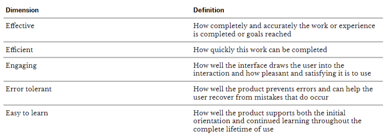
Dimension 1: Effective
Create scenarios with various levels of difficulty or ambiguity in study tasks.
Evaluate tasks for how accurately they are completed and how often they produce undetected errors.
Dimension 2: Efficient
Construct the test with enough repetitions of typical tasks to create a realistic work rhythm.
Use working software or a high fidelity prototype.
Collect timing data, but also interview participants for their subjective impression of the program.
Dimension 3: Engaging
Use satisfaction interview questions or surveys as part of the evaluation.
Do comparative preference testing of presentation design.
Construct the test so that participants are able to abandon a product if they want.
Dimension 4: Error Tolerant
Construct scenarios to create situations in which errors or other problems are likely.
Observe how easily or accurately users are able to recover from problems when they occur.
Dimension 5: Easy to Learn
Control how much instruction is given to test participants, or recruit participants with different levels of experience or knowledge.
Mix frequently used task with scenarios for functions used less often or tasks with unusual variations.
Testing-based methods
Definition: Empirical, i.e., based on data, testing with users who represent the target population of design solutions.
Usability Testing
Definition: Observing users performing tasks with a design solution and asking them questions about their experience with the solution.
Observations include user actions, behavior, and verbal descriptions.
when:
Depending on where usability testing is used in the design process, the testing can take two forms:
Formative Testing
Definition: Testing done throughout the design process to diagnose and address design problems.
Involves small number of users; used repeatedly; informs design improvements.
It “forms” the next iteration of the design.
Summative Testing
Definition: Testing done at the end of the design process to establish the baseline usability of the design solution.
Involves a larger number of users; comparative testing; utilizes large number of metrics and statistics methods.
Usability Testing Contexts
Laboratory Testing
Definition: Testing in the lab set up to capture user behavior through screen recording, software logging, over-the-shoulder video recording, eye tracking, etc. and to allow the design team to observe and analyze the test session.
Field Testing
Definition: Testing in the target setting of use for the design solution with the target profile of users
Guerilla Testing: Low-cost usability testing set up in a public space where passers by are recruited as test participants a volunteers or small compensation.
Remote Testing: Definition: Testing a hi-fi prototype or early version of a deployed product over the internet.
Different forms of remote testing:
— Moderated: expert guides and observes, asks questions
— Unmoderated: participants completes tasks on their own sschedule, captures behavior (e.g., A/B testing)
Key Dimensions of Usability Testing
When designing a usability test, we need to define and characterize the following four dimensions
Why: Goals
What: Scope, task/scenarios
How: Approach, metrics
Who: User subgroups, study team
WHY
Formulate goals as questions that the test is designed to answer and specify two components.
Test goals should specify:
Desired outcomes
Basis for comparison
WHAT
We need to determine the scope of the testing, including what aspects of the system design, what tasks, and what scenarios will be included in the testing.
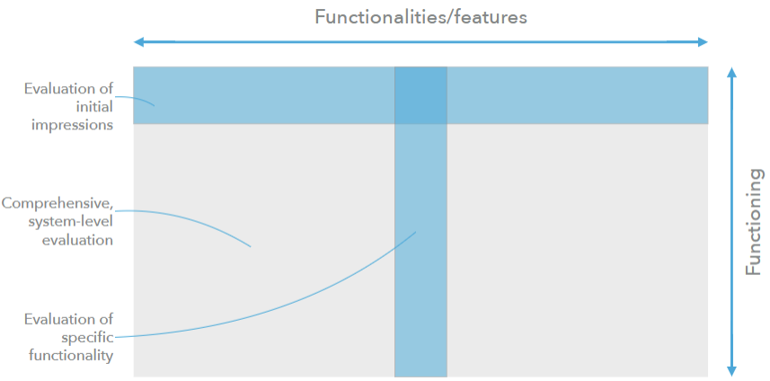
Defining the what involves defining:
— Questions: Expectations of specific outcomes, e.g., whether or not the user will successfully achieve a particular goal.
— Tasks: The sequence of actions that users are expected to perform to achieve goals.
— Scenarios: Brief stories that provide users with context and goals in using the system.
Scenarios should be ordered:
— From initial impressions to specific tasks
— From general to specific
— From short to long
— From simple to complex
HOW
The how of the usability test will depend on:
- Whether the test is formative or summative
- Whether the test is for a single design or comparative
Types of Measurement
Qualitative data: observations of user actions and behavior, comments, and answers to questions
Quantitative data: measurements of user performance, error, and ratings of the design
WHO
The who of the usability test includes:
- Participants who represent the target user population
- Team roles during usability testing
Participants should represent the user subgroups that is targeted by the design. Subgroups characteristics can be defined by experience, familiarity, skill, occupation, domain knowledge, and demographics.
Once user subgroups are identified, several sessions of the study can be planned for each or a subset of the subgroups. The participants should be representative of the targeted subgroups.
The testing team usually involves:
Moderator who guides the participant and probes them with questions.
Note-taker who captures data.
- Observer(s) from the UX team.
- Technician, who operates the tested system or the testing equipment.
The Test Plan
The outcome of the design of the usability test is a test plan document that captures the why, what, how, and who.
Sometimes called a test protocol.
Measures
Performance metrics
Five basic types of performance metrics:
- Task success: measures how effectively users are able to complete a given set of tasks. Can be used as binary or levels of success.
- Time-on-task: measures how much time is required to complete a task.
- Errors: measures the mistakes made during a task.
- Efficiency: measures the level of effort required to complete the task.
- Learnability: measures how performance changes over time.
Self-report metrics
Definition: Asking participants about their perceptions of and experience with a design solution using a set of questions.
Participants provide quantitative (e.g., ratings, rankings) or qualitative (e.g., open-ended, narrative) responses.
SUS
Ten-item questionnaire that focuses on usability.
Can be used for relative comparison or absolute benchmarking.
USE
Includes four sub-scales for usefulness, ease of use, ease of learning, and satisfaction.
Issue-based Metrics
Definition: Problems that users encounter in using a system.
How do we identify issues?
— User task actions
— User behavior
— Verbal expressions of confusion, frustration, dissatisfaction, pleasure, surprise, confidence or indecision about a particular action that may be right or wrong
— Not saying/doing what they should have done/said
— Nonverbal behaviors, e.g., facial expressions, gaze
Severity ratings
Definition: Assessments of issues that help the design team prioritize design efforts. Based on:
- Impact on user experience
- Predicted frequency of occurrence
- Impact on the business goals
- Technical/implementation costs
Severity levels
Low: Issues that annoy or frustrate participants but do not play a role in task failure.
Medium: Issues that contribute to significant task difficulty but do not cause task failure.
High: Issues that lead directly to task failure.
Expert-review-based methods
Definition: Also called usability inspection, review-based evaluation by experts who follow well-established protocols to inspect the usability of design solutions.
Methods: Heuristic evaluation, cognitive walkthrough, pluralistic walkthrough, feature inspection, consistency inspection, standards inspection, formal usability inspection.
Heuristic Evaluation
Definition: Developed by Jacob Nielsen, heuristic evaluation involves having a small set of evaluators examine the interface and judge its compliance with recognized usability principles (the “heuristics”).
Process
1: Visibility of system status
The system should always keep users informed about what is going on, through appropriate feedback within reasonable time.
E.g., email clients making a swoosh sound when sending email.
2: Match between system and the real world
The system should speak the users’ language, with words, phrases and concepts familiar to the user, rather than system-oriented terms. Follow real-world conventions, making information appear in a natural and logical order.
3: User control and freedom
Users often choose system functions by mistake and will need a clearly marked “emergency exit” to leave the unwanted state without having to go through an extended dialogue. Support undo and redo.
E.g., undo for delete/archive in email clients
4: Consistency and standards
Users should not have to wonder whether different words, situations, or actions mean the same thing. Follow platform conventions.
E.g., component libraries to achieve consistency within an app; platform conventions to achieve consistency across apps.
相同颜色相同含义
5: Error prevention
Even better than good error messages is a careful design which prevents a problem from occurring in the first place. Either eliminate error-prone conditions or check for them and present users with a confirmation option before they commit to the action.
— Autocorrect in search
— Real-time feedback on new user names, password strength, etc.
— Attachment reminders in email clients
6: Recognition rather than recall
Minimize the user’s memory load by making objects, actions, and options visible. The user should not have to remember information from one part of the dialogue to another. Instructions for use of the system should be visible or easily retrievable whenever appropriate.
Recently viewed/ previous looking
7: Flexibility and efficiency of use
Accelerators — unseen by the novice user — may often speed up the interaction for the expert user such that the system can cater to both inexperienced and experienced users. Allow users to tailor frequent actions.
新人引导,满足新手和老用户的需求
8: Aesthetic and minimalist design
Dialogues should not contain information which is irrelevant or rarely needed. Every extra unit of
information in a dialogue competes with the relevant units of information and diminishes their relative visibility.
9: Help users recognize, diagnose, and recover from errors
Error messages should be expressed in plain language (no codes), precisely indicate the problem, and constructively suggest a solution.
10: Help and documentation
Even though it is better if the system can be used without documentation, it may be necessary to provide help and documentation. Any such information should be easy to search, focused on the user’s task, list concrete steps to be carried out, and not be too large.
help center
Heuristic Evaluation Reporting
Definition: A document that highlights the top three to five usability problems and suggested solutions.
Heuristic evaluation reports usually include:
- Prototype screen, page, location of the problem
- Name of heuristic
- Reason for reporting as negative or positive
- Scope of problem
- Severity of problem (high/medium/low)
- Justification of severity rating
- Suggestions to fix
- Possible trade-offs (why the fix might not work)
Pros & Cons
Pros:
— Inexpensive and intuitive
— Can be used frequently and any time during the design process
— Effective at early stages of design
— Serves as a training tool for designers
Cons:
— Does not capture all aspects of usability
— Does not provide a comprehensive understanding of the interaction
— Might discourage user testing
— May result in false positives
Heuristics for Conversational Interfaces
Seventeen heuristics that fall into five broad categories:
- General
- Conversational style
- Guiding, Teaching, and Offering Help
- Feedback and prompts
- Errors
S5: Pay attention to what the user said and respect the user’s context
— Leverage user input when it can be used as a parameter to a command.
— Remember what the user has said in the current conversation.
— Use context you already know about the user to fill in fields, but confirm them.
— Use context to respond intelligently (e.g., location/environment, time constraints, # of users, user identity/age).
S12: Confirm input intelligently.
— Confirm input implicitly through results or next prompt.
— Confirm irreversible or critical actions explicitly and even allow undo a”er confirmation.
Cognitive Walkthrough
Definition: Expert review method where a usability specialist assesses the learnability and discoverability of a design by posing and answering a set of questions.
What do we need to perform a cognitive walkthrough?
— A prototype
— A user profile
— Set of tasks
— Sequences of actions
Pros & Cons
Pros:
— Powerful for:
— Walk-up-and-use interfaces
— New concepts/forms of interaction
— Systems designed for various user profiles
— Can be performed frequently and at any stage of the design process
Cons:
— Focuses only on discoverability/learnability
— Best when used with usability testing